Designed by Napp Studio & Architects, the Adventist Medical Centre – CWB revolutionizes the concept of medical interiors. Through its thoughtful design and emphasis on user experience, it seamlessly blends functionality with a comforting environment that caters to both the physical and mental well-being of individuals.
Adventist Medical Centre – CWB, a transformative design pilot project by Napp Studio & Architects, is redefining medical interiors with a unique blend of operational efficiency and user-centric experience. This is a space where the sterile white of traditional clinics gives way to a warm and welcoming environment, catering to both the body and the mind.
The design concept takes inspiration from the natural scenery of canyons and pink lakes, drawing on the calming ambiance and materiality to create a sense of warmth and security. The color palette, a soothing blend of various shades of pink and beige — utilizing St Leo’s Marble Paint from Wool — subverts the typical sterile white of medical interiors, to render a serene and inviting space. It's a nod to the Adventist Health’s branding color pink but with a twist, signaling a shift towards holistic wellness that embraces both physical and mental well-being.
Situated inside an office tower, the challenge of the project was to transform the long and narrow floor plate, punctuated by large peripheral columns, into a welcoming and open space. The solution was to create an internal street vista, with semi-open programs along the corridor that dissolve the solid tunnel-like feel. The layout ensures a continuous circulation flow, positioning all consultation rooms and staff areas along the windows for natural light, while the operation rooms that require a completely concealed and controlled environment are located in the internal core.
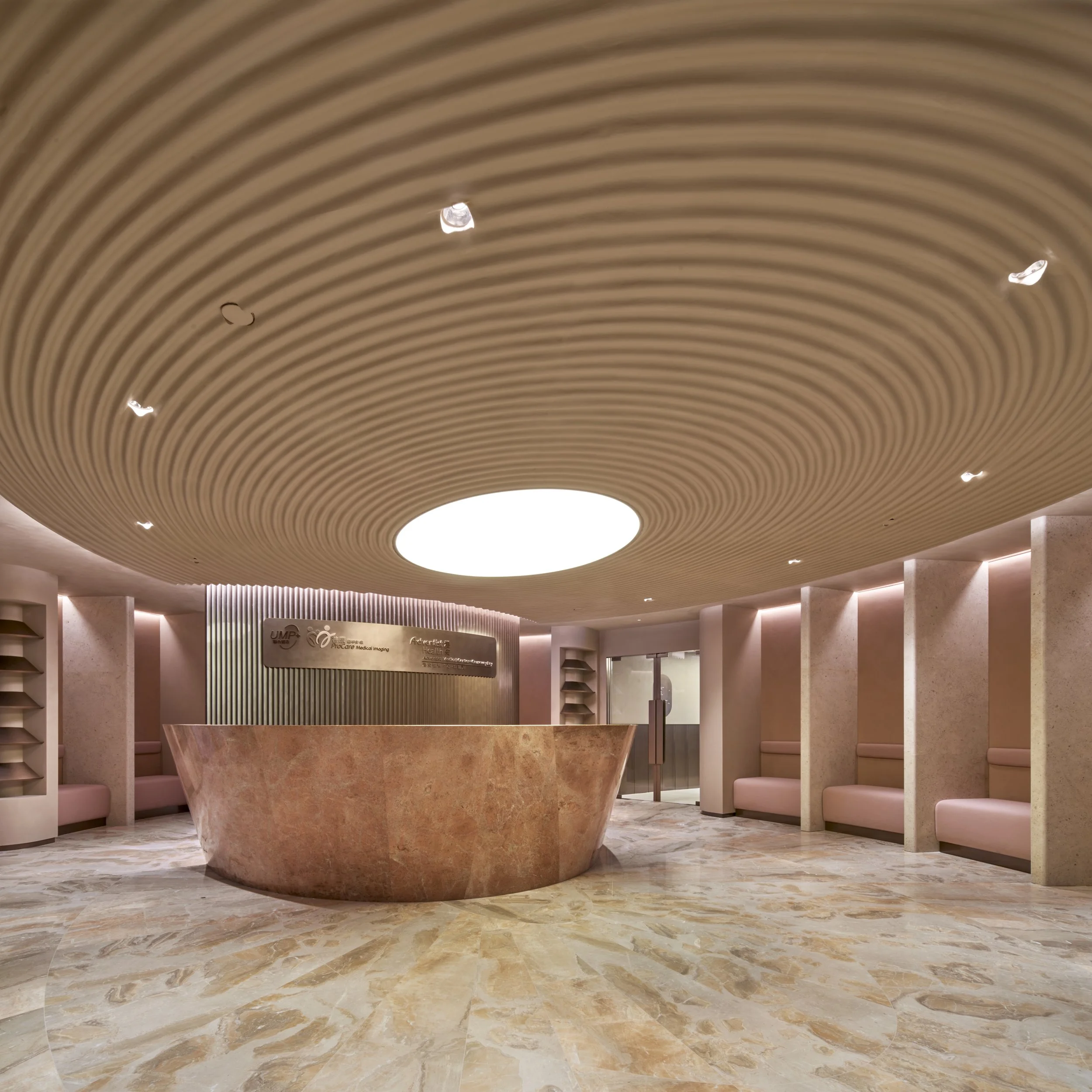
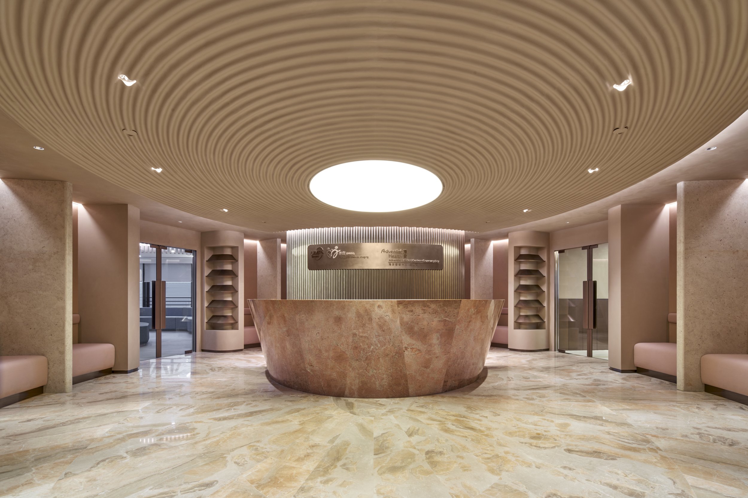
The public areas, including the reception lobby and waiting area, echo the iconic circular shape of the Adventist Hospital at Stubbs Road, aiding wayfinding. The grand reception lobby, with its iconic oval shape and limestone partition walls, offers patients a sense of privacy and comfort. Its rippled ceiling, adorned with a central light box, extends the spatial perception, making the limited floor-to-ceiling height seem expansive.
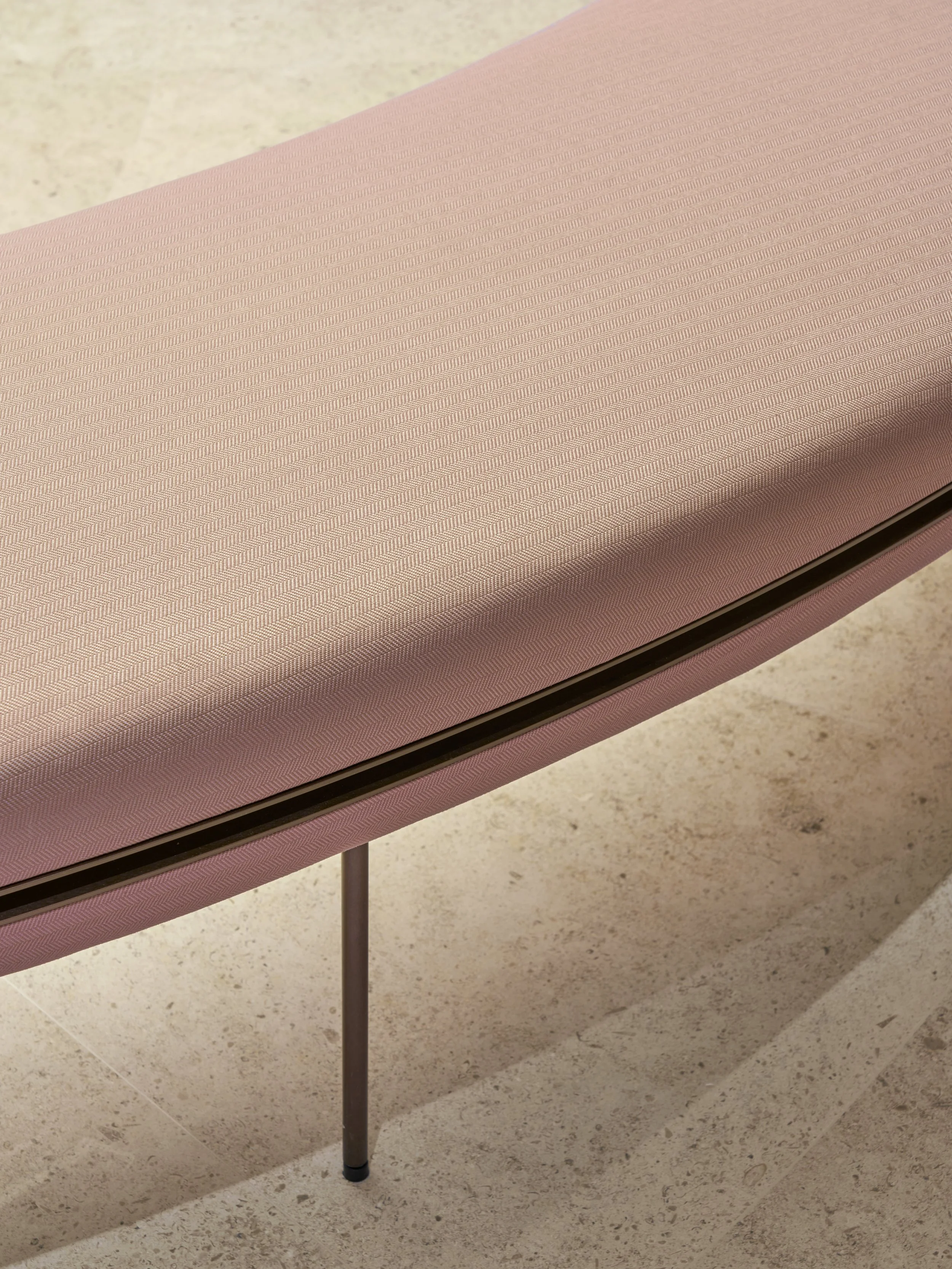
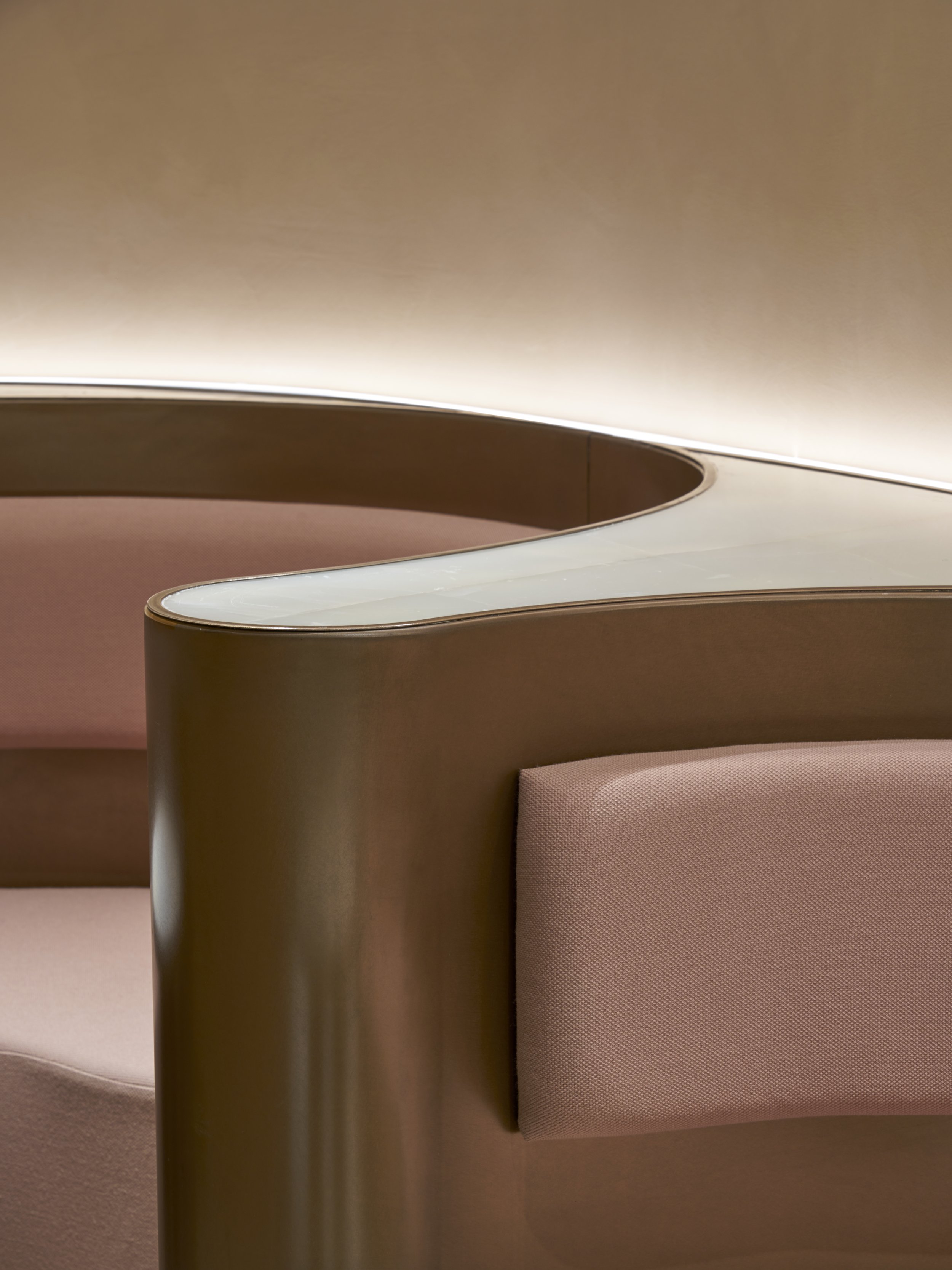
The promenade, which houses the pharmacy and meeting rooms, connects the main reception lobby to the circular waiting area. Here, the earthy tones soften into a pale pink, with sleek terrazzo walls folding into seating benches beneath an extensive seamless circular stretched ceiling, mimicking a giant skylight. The center features a modular donut sofa bench, composed of six units that can be freely arranged, creating an auditorium-like seating for medical seminars.
For those seeking respite from their wait, a F&B lounge with panoramic city views awaits, featuring a signature green onyx and bathed in sunlight for visitors or patients to rest and recharge.
In a bid to elevate the user experience even further, a secret VIP area, the Shalom Lounge, is hidden behind the open counter at the main reception lobby. This exclusive space provides booth seating and its own refreshment bar, offering a heightened level of comfort and privacy for VIP clients.
Related Content
Studio Otamto designed a tranquil, minimalist wooden pavilion in Warsaw's Mokotów district, combining vernacular architecture principles, skilled craftsmanship, and collaborative efforts to create a shared sanctuary amongst urban vibrancy.
Located in a village near Albacete, an annex to a nursery school designed by Iterare arquitectos combines interconnected volumes with an engaging interplay of light.
In Burgos, Spain, a unique cultural centre melds homey comfort with communal utility, redefining perceptions of public spaces.

