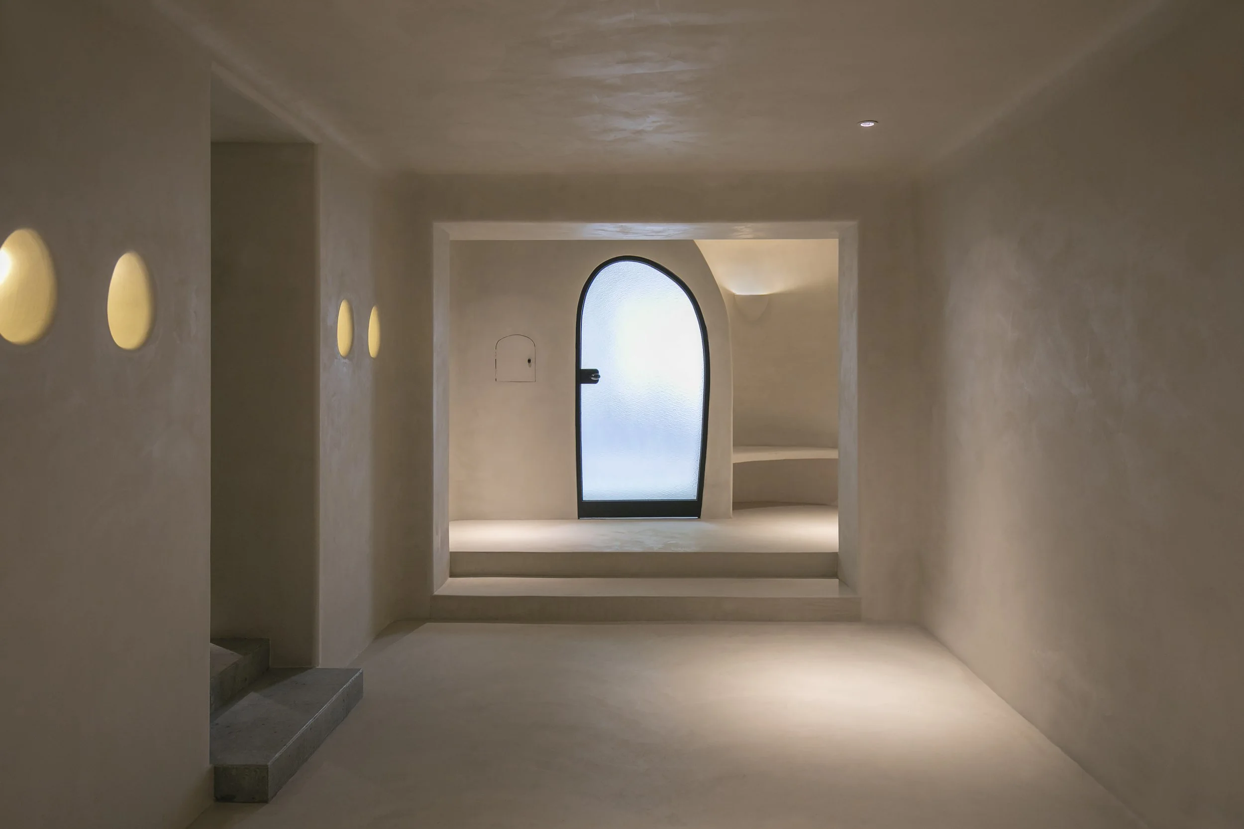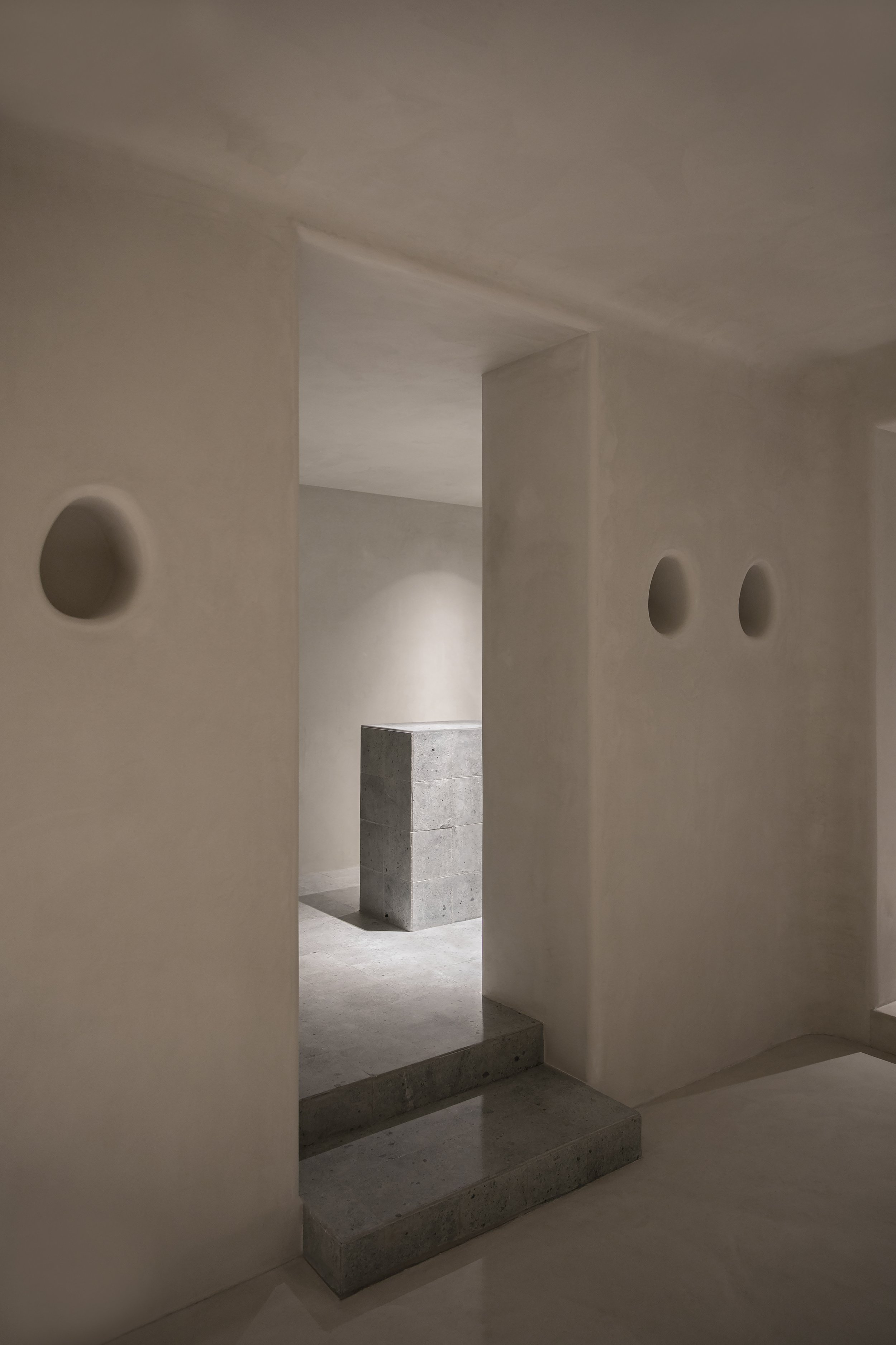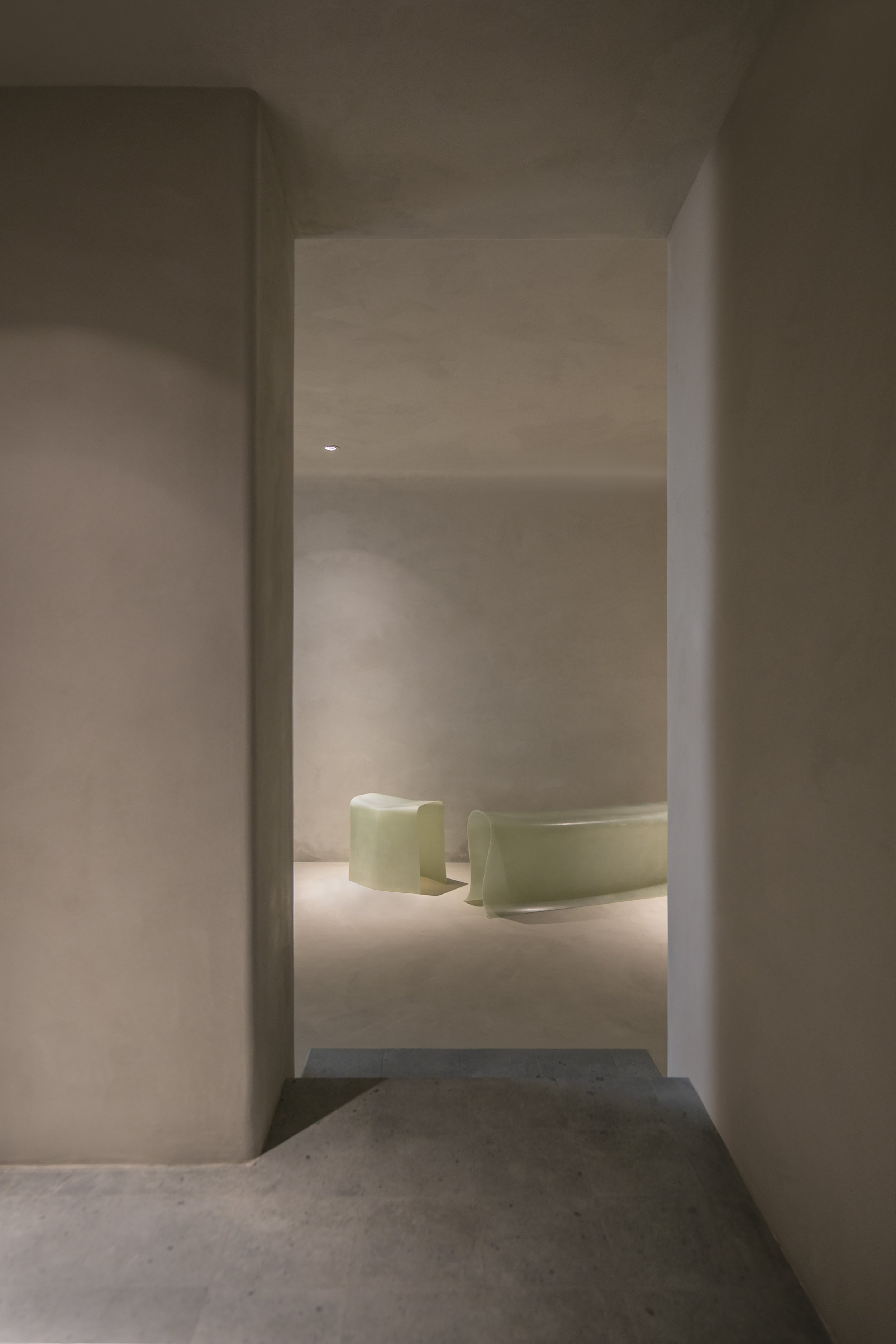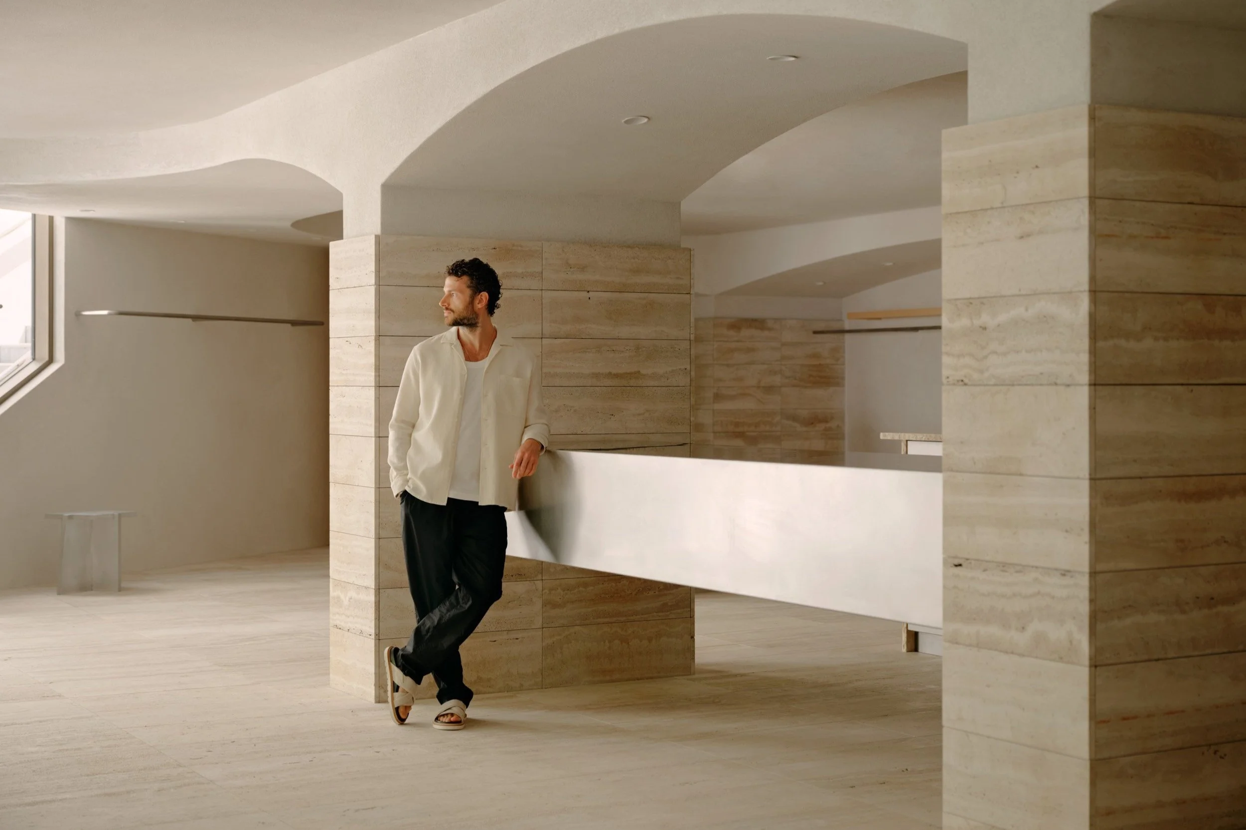
Single Person Gallery - a boutique gallery in Shanghai - is reimagined by Offhand Practice as a sculpted enclave that echoes the rugged soulfulness of a cave.
OFFHAND PRACTICE was founded in 2018 by partners Yuan Yuan & Nie Xuan in Shanghai, China. OFFHAND PRACTICE have worked on various project types and scales, such as bookstore, multi-brand boutique/fashion store, art gallery, pop-up store and residence.
Words by Offhand Practice
Photography by Yiqing Gao
The decision to transform this 60-square-meter street diner was made in December, where the client decided to use this venue as a vintage houseware gallery, named “Single Person”. Stochastically, this decision coincided with the designers, Offhand Practice, upon their first visit to the venue.
In order for the team to kickstart with their design, systematic and design coherency became the key. It was at this stage that the space was thoroughly analysed. The existing structural walls divide this long and narrow space into four individual rooms. What they did was categorise different products in each area and integrated the client’s needs with a straightforward, practical solution to develop a comprehensive plan.
A narrow space with light sources only at both ends, isn’t this a cave? The word CAVE came to their minds when they first sought to define space as a whole.
“The space shares similar physicality with a cave, while they were verifying this concept, they realised that CAVE is not an imposed concept but manifested by the nature of the site itself. It is found in its physical reality.”
Once the overall concept of CAVE was established, other design elements for this space that shares the same design language naturally fell into place. We researched the cave itself and cave-related design, and developed design details with functional requirements and the site’s own specific conditions in mind.
The first site constraint (which can also be viewed as a feature) is the lack of natural lighting in the inner space, where they carved out openings on walls throughout the entire space to create indirect lighting sources. A row of small niches was created along the wall of centre gallery, to bring out a candle-lighting ambiance in the space. An irregular peeking window is punctured for visual connection between centre gallery and the side gallery. As for the exit gallery, a row of skylights is designed to guide the visitors out of the cave. Within this CAVE concept, the skylight is given a great vertical depth to simulate the way light penetrates through thick cave walls. By controlling the way light enters, it magnified the experience of being in a cave.
Another feature of the site is the spatial hierarchy. As shown in the elevation, each room is placed on a different level. Since the original civil structure cannot be changed, the team decided to take advantage of the height difference between each space, to highlight the depth and progressive level of a cave. Flooring colour that is continued on steps thrust into the adjacent space thus creating an infiltration gradient between two areas. The curved platform in the centre gallery is in response to the client’s request for an independent merchandise stand.
Apart from using height differences to indicate space, different shades of colour are applied to show further emphasis on depth. The first area which includes centre gallery and side gallery is in white enamel. The second area, the corridor gallery is in ochre with a darker shade, while the last area, the exit gallery is in Sienna, the darkest shade of all. Using earthy colour is a natural inclination under the concept of CAVE. The lightness of shades indicates the physical attributes of the cave, where the light is dimmed, and the space is darkened after going deep into the cave.
Aside from the colour palette, the paint textures used were also varied in each room to bring a subtle contrast to the spatial experience.
The entrance is built very close to the cave entrance they imagined. The texture of the façade also resembles stucco but is actually a result of pebble wash.
Single Person is a cooperative effort with the client. The maze niche of the corridor gallery is made directly out of the client’s sketch, most notably the irregular window in the centre gallery. As more oval-shaped details were added to the space, all wall intersections details were gradually changed to curves.
Every cabinet handle in the space is carefully selected at a flea market in Berlin. The team enjoys collecting interesting materials and pieces their our projects while traveling. These peddle-shaped antique ceramic handles are a joyful find.
For the faucet, there was no clue at the beginning, we were not sure what kind of faucet could match the space. Fortunately, our designer stumbled on a brand called Jee-O from the SketchUp warehouse.
Design Detail
OFFHAND PRACTICE was founded in 2018 by partners Yuan Yuan & Nie Xuan in Shanghai, China. OFFHAND PRACTICE have worked on various project types and scales, such as bookstore, multi-brand boutique/fashion store, art gallery, pop-up store and residence.
Learn more about some of their latest projects:
Instagram: @offhandpractice
Website: offhandpractice.com
Related Content
Venroy in Byron Bay in collaboration with Sarah I’Anson
Australian leisurewear label, Venroy, has announced the opening of their seventh store, located at 139 Jonson Lane, Byron Bay. Like all Venroy stores, Byron Bay is designed to be transportive, taking the customer on a journey to aspirational destinations around the globe.
Volum by Snøhetta for Lodes
Lodes has renewed its collaboration with Norwegian architecture and design studio, Snøhetta, to expand the Volum collection.


