KÄSE COFFEE - HOFFICE
RESTORING LOST FORMS
Seoul-based design office, HOFFICE, has created a sleek and alluring interior for a local cafe, KÄSE COFFEE - marrying brutalist rigour with minimalist sophistication to transform a mundane experience such as coffee into one that is immersive and vivid.
Established in 2021, HOFFICE is a Seoul-based design office specialising in the overall art and design of architecture, space, furniture, objects, exhibitions, installations, and art direction. Their process is established on the basis of experimentation, exploring various concepts inspired by the context of their given project. Based on a primitive construction method, they strive to study and interpret the contexts of their projects in a more contemporary manner and present a solution. In this project, KÄSE COFFEE, HOFFICE collaborates with spatial designer Bon-woong Gu to make KÄSE COFFEE on the basement floor of a building in Goyang-si.
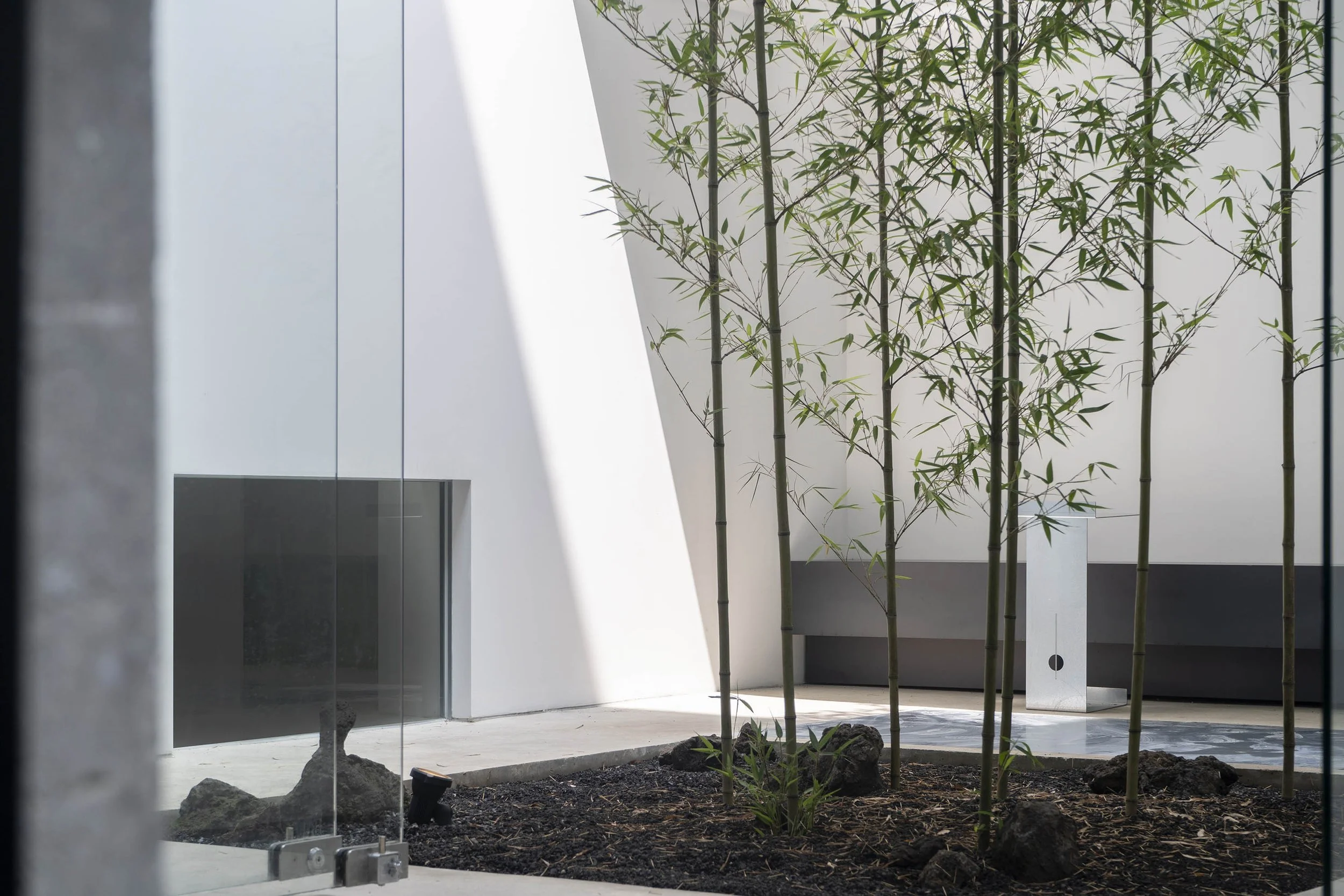
Encompassing two sunken courtyards, the original site was divided into separate sections to perform various functions, including an office, warehouse, and courtyard which was left unattended as a garbage dump and storage space. The concept behind the project was to restore the building’s original form of architecture and restore the formed to a place where light and air could thrive - by demolishing all of the added partitions and redirecting the seating to overlook the courtyards.
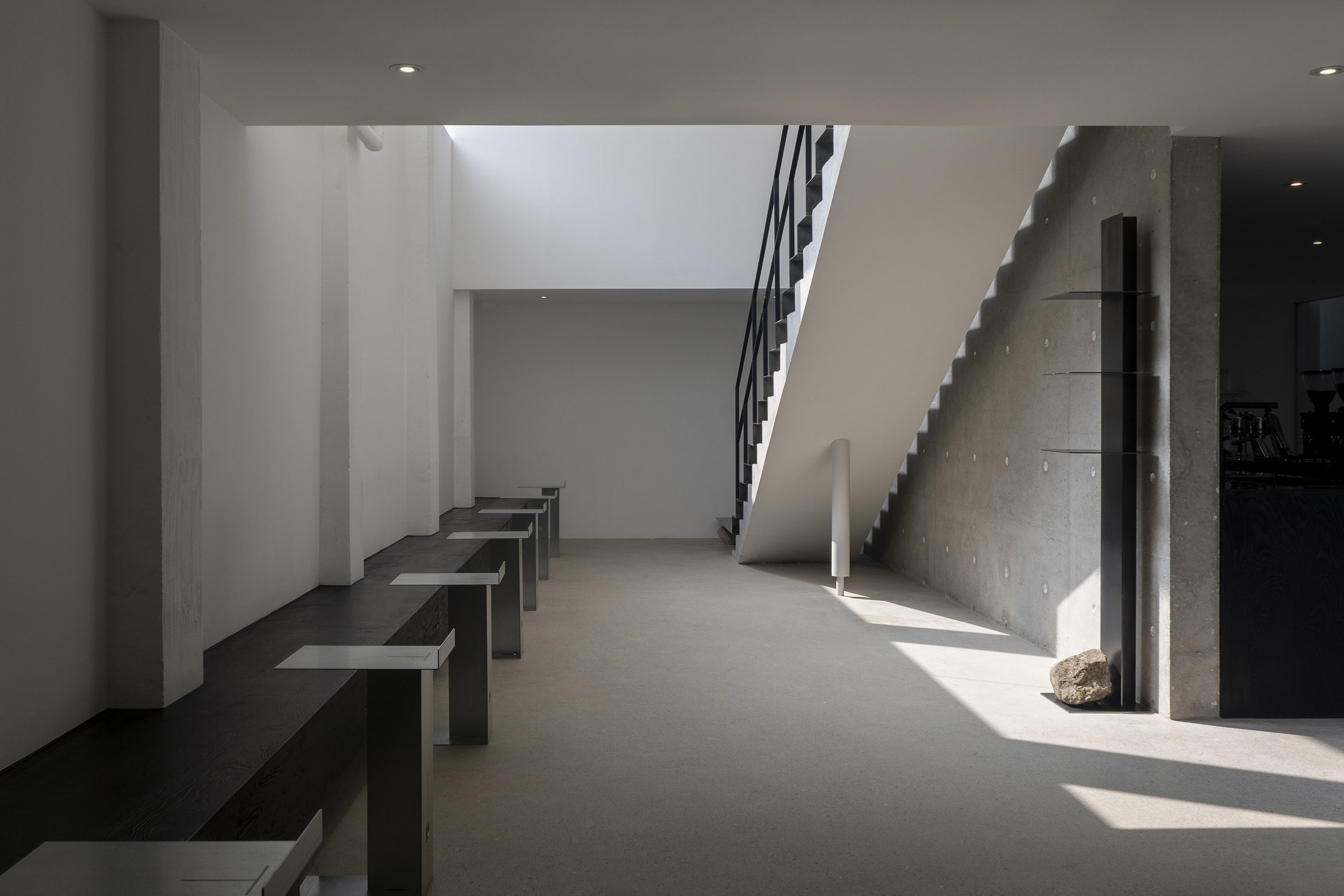
The circulation within the space revolves around the central coffee bar. The intent was to encourage visitors to keep moving and circulating within the cafe, making two separate staircases that would lead them to different parts of the space - one by the main entrance and another in the courtyard. The stairs by the main entrance are used to guide visitors as they arrive and cover the existing concrete structure with an iron plate that resembles the red carpet commonly used in award ceremonies. While the stairs in the courtyard serve as an emergency escape, intended to look like an object containing "Temporality" as they rust by natural weathering.
Location : 29, Sandu-ro 175beon-gil, Ilsandong-gu, Goyang (@kase_coffee)
Spatial Design : Ho Han (@han_ho_), Bonwoong Gu (@gubonwoong)
Branding : heesosung (@heesosung)
Landscape : SeOLoN (@seol_on_)
Artist Collaboration : Sisan Lee (@leesisan)
All seats are redirected to overlook the central courtyard and the heights of the windows were readjusted frame views into and of the space, ensuring privacy for visitors as they fully immerse themselves in both internal and external experiences.
By blocking the intersection of eyes, visitors can also appreciate the changing nature of Korea in their seats indoors, and enjoy the barista's rhythmic behaviour and shadows drawn on white walls over the swaying bamboo trees from the outside.
This concept was also applied to the design of the access road, which disrupted the external and internal boundaries to create an ambiguous transitional space by changing the location of the entrance inward and separating the material on the floor. This space is open to the community as well as visitors, operating as an open space for passers-by to avoid rain and wind or even to experience the tranquility without entering the cafe.
To emphasise the constructive concept, the team applied a consistent tone and manner throughout the space as achromatic. The new covering surface is white, the purest colour, the masses in charge of the function are black, and all materials used in the space are designed to reveal their original properties. In addition, white holes that were not removed in the work of removing paint on the concrete surface operated as elements of facade design from the outside.
To induce maximum seat efficiency and natural behaviour of visitors on a plan divided into narrow and long sections, the concept of Pyeong-sang (traditional Korean furniture) was utilised. Pyeong-sang is a kind of over-scale bench, and due to its lack of direction and a high degree of freedom in action, Pyeong-sang has always existed in the place of traditional Korean rakugo. This acts as a contextual element in line with the program of space-seeking comfort and as an object that imbues a heavy impression.
Inspired by a rock left in a small courtyard at the time of demolition, natural stones were used structurally in the details of the space. To further emphasise this, the studio collaborated with Korean artist Sisan Lee to produce an object for this space. Sisan Lee is an artist who makes sculptures by paying attention to the individual uniqueness of natural stones and had created an object with a monumental (symbolic) role with the motive of Jangseung, a totem of Korea for the project.
BX was designed by brand director heesosung who introduced a gallery system in replacement of the elements of space with artworks. A leaflet functioning as a menu is arranged at the entrance for visitors to experience the space as if they were watching an exhibition.


