HI ATELIER
OLLY APARTMENT
Words by Hi atelier
Renderings by Hi atelier
Contemporary and historic narratives intertwine at Hi atelier’s latest residential project, Olly Apartment located in Podil, Kyiv.
Contemporary and historic narratives intertwine at Hi atelier’s latest residential project, Olly Apartment located in Podil, Kyiv.
The main goal of this project is to create an excellent apartment for rent. The client has good design taste, but blurred wishes regarding the future concept of the apartment. This is why the team decided to begin by making research about the location and context of the apartment, enabling them to create a strong vision regarding how this small yet cozy space can be rethought.
Podil is a historic neighbourhood in Kyiv, where architecture from the 17th to 19th century is retained. Here, different architecture styles coexist – Ukrainian Baroque, Russian classicism, eclecticism, and modernism.
For this concept, the team had chosen an old-fashion style mood combined with ascetic minimalism. This approach helped the team in creating a quite minimalistic and multi-faceted home where any inhabitant can leave their thoughts and recreate their own story. The home is instilled with modern materials, techniques, and combined with vintage decorations and recycled elements.
The Bedroom.
The original plan of the home had a small bedroom, a space so small that even the bed could barely fit in. The team removed the pre-existing walls of the adjacent room, connecting them to form one large, interconnected space. The bedroom consists of three different areas: a place for rest, work, and storage, with an extra small walk-in closet.
The rest area is designed with a symmetrical technique, one that recreates the feeling of a hotel room. When you lie on the bed, other parts of the room are hidden, removing visual noise and disturbance, for inhabitants to enjoy the calming rays of sunshine. In the working area, they placed a warm composition of finishing, including a custom table covered by old-fashioned parquet, Thonet’s S533 N vintage chair designed by Ludwig Mies van der Rohe in 1927, and Simos Jame’s Buster Table Lamp designed by Chris Martin. To make this space feel more minimalistic, they added a large wardrobe with a secret door that leads to a small dressing room. This technique blurs the lines between the main area and the small room.
The Kitchen-studio
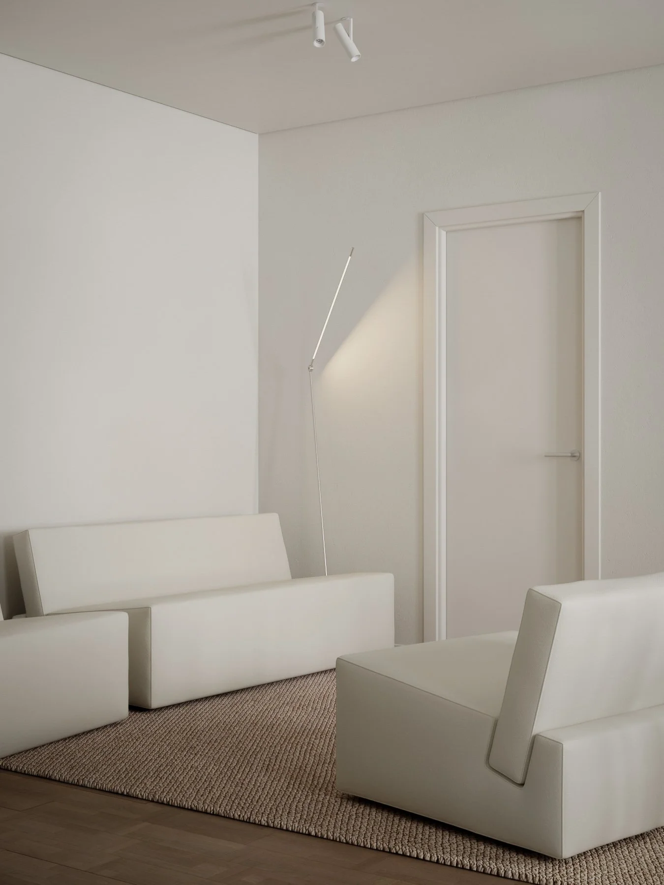
This space is composed of empty walls and exquisite furnishings that set the right mood for rest, dining, kitchen, and hallway areas. In fact, all three of these areas are combined into one large space, but the kitchen and hallway remain separated visually by the walls.
Included in this area is Juniper’s Thin Floor Lamp designed by Peter Bristol and a mix of Propro’s Modular Node Sofa, two Node Armchairs designed by Nata Kurilenko, and Fogia’s Pastille Table designed by TAF Studio. Sources of light are all set in the ceiling which they deliberately hid, allowing for a cleaner composition and to expand the space visually. Adjacent, the dining room juxtaposes the muted kitchen colours with a set of grey Masculo Dining Chairs by GamFratesi for Gubi and a custom-designed dining table, differentiating the dining room from the kitchen in the compact space. &Tradition’s Formakami JH3 Pendant Lamp designed by Jaime Hayon is also hung over the table.
“ We like the feeling of laconic and cozy emptiness that we have created. It may be a killer for some, but not for us. We love the way this small space talks to people — not too loudly. This room gives a space for your thoughts.”
- Ihor Havrylenko, founder of Hi atelier
The Bathroom.
The new bathroom is more spacious than the prior, quipped with a built-in bathtub and vintage stone-topped console with a round washbasin standing on. The design of the space was kept simple and revolves around the central idea of injecting natural light. The team, therefore, craved a window into the wall between the bathroom and kitchen whilst the bright stone texture creates the feeling of a cosy cave.
All of the room carries a similar mood. This was not a coincidence but was intentional. The team at Hi atelier had always enjoyed crafting a central design line through each of their projects; similar colours and materials correlate each of the spaces into one, big, central idea. This time around, they went with a more natural, forest fragrance, old-fashioned design notes, and modern furniture pieces made primarily of steel, artificial leather, and wood.


