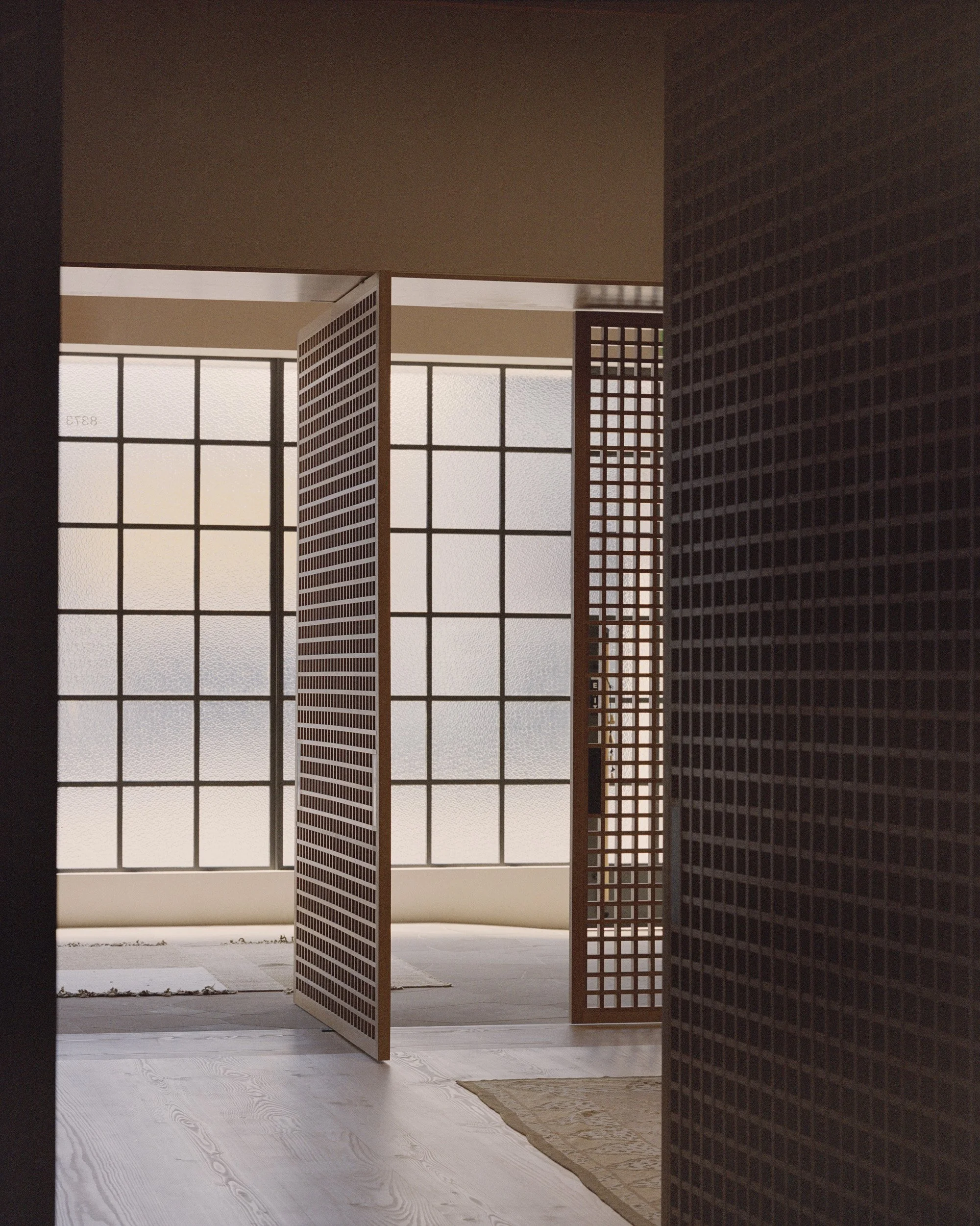
Lonely's first international flagship store in Melrose Avenue, West Hollywood, was transformed into a contemporary and inviting showroom through a collaboration between Knight Associates and Lara Hoad Architecture & Design. The former gallery was modernised to create a space that showcases the New Zealand-based lingerie brand's products.
The Lonely boutiques speak strongly about layers of intimacy; a space that focuses on the customer, their experience, and the process of buying lingerie remains essential.
Words courtesy of Knight Associates
Photography by Rory Gardiner
Lonely has been creating and crafting with love since 2003. Their offerings of lingerie, womenswear, swimwear, and lifestyle products are made for exploration and enjoyment, with a unique palette that creates artistic expressions for customers to discover themselves as the muse.
Lonely Melrose, the brand's first international flagship, is nestled on Melrose Avenue in West Hollywood. With two existing retail touchpoints in Auckland and Wellington, New Zealand, Lonely boutiques are designed as calm sanctuary-like spaces, where customers can relax and experience a zone of self-love and honor, intimately experiencing collections with guidance from brand hosts.
Knight Associates, in collaboration with Lara Hoad Architecture & Design, undertook an extensive design and permitting process, with the City of West Hollywood, to refurbish both the main retail space and store-front and to reconfigure and modernize the former gallery into a contemporary and inviting showroom. The Melrose boutique is a place for customers to interact and buy product on both an analogue and digital level. Forward-thinking with regard to digital integration but primarily service focused.
The Lonely boutiques speak strongly about layers of intimacy; a space that focuses on the customer, their experience, and the process of buying lingerie remains essential.
The design direction of the space references a dialogue between hard and soft surfaces – between confidence and intimacy.
The Melrose space makes a departure from the cool modern delineation of the previous Auckland and Wellington stores with a soft and enveloping interior. Materials and textures are muted yet tactile – a palette of Douglas Fir, aged brass, pitted plaster, and stained Elm continue the brand themes of raw sophistication, honesty, and simplicity. The space aims to say something romantic but in a modern vocabulary.
Through calm and confident forms, the interior design keeps service and customer experience at its heart; large operable joinery provides the ability to experience the brand and accessory collections as an inviting open-plan showroom experience or subtly delineated for more intimate private consultations and fittings. Storage is discreetly addressed through freestanding vintage furniture in the main retail spaces and administrative and stock fulfilment areas are positioned at the rear of the store. The newly constructed façade joinery, finished in cathedral glass, filters natural light and presents an adumbrated view to the interior, furthering discretion for customers.
Knight Associates is an Interior Architecture & Design studio working on a global portfolio of commercial, residential, and experiential projects, based in Auckland, New Zealand.
Instagram: @knight.associates
Website: knightassociates.co.nz
LARA HOAD ARCHITECTURE DESIGN is a female forward, collaborative architecture and design practice based in Los Angeles, California. With a focus on community, sustainability and social change, the practice is led by Lara Hoad, AIA, LEED AP.
Instagram: @larahoadarchitecturedesign
Website: lharchitecturedesign.com
Related Content
Canyon House and Serpentine Bar by folistudio
The Canyon House and Serpentine Bar are experimental architectural creations by folistudio that showcase their ingenuity and creativity.
Caracas by Sierra + de la Higuera
Sierra + de la Higuera (S+DLH) have crafted a haven of warmth and tranquility in Caracas, capturing the essence of balance in every detail.


