K.Holland Architectural Interiors took a deep dive into the spirit of Japanese design to extract the essence of what Australians recognize as Japanese and create a new face for the LeTao cheesecake brand as it enters the Western market.
The result is a beautiful interior that showcases the brand’s products in a luxurious yet minimalistic way, while incorporating strict geometry and raw materials.
Photography by Kristoffer Paulsen
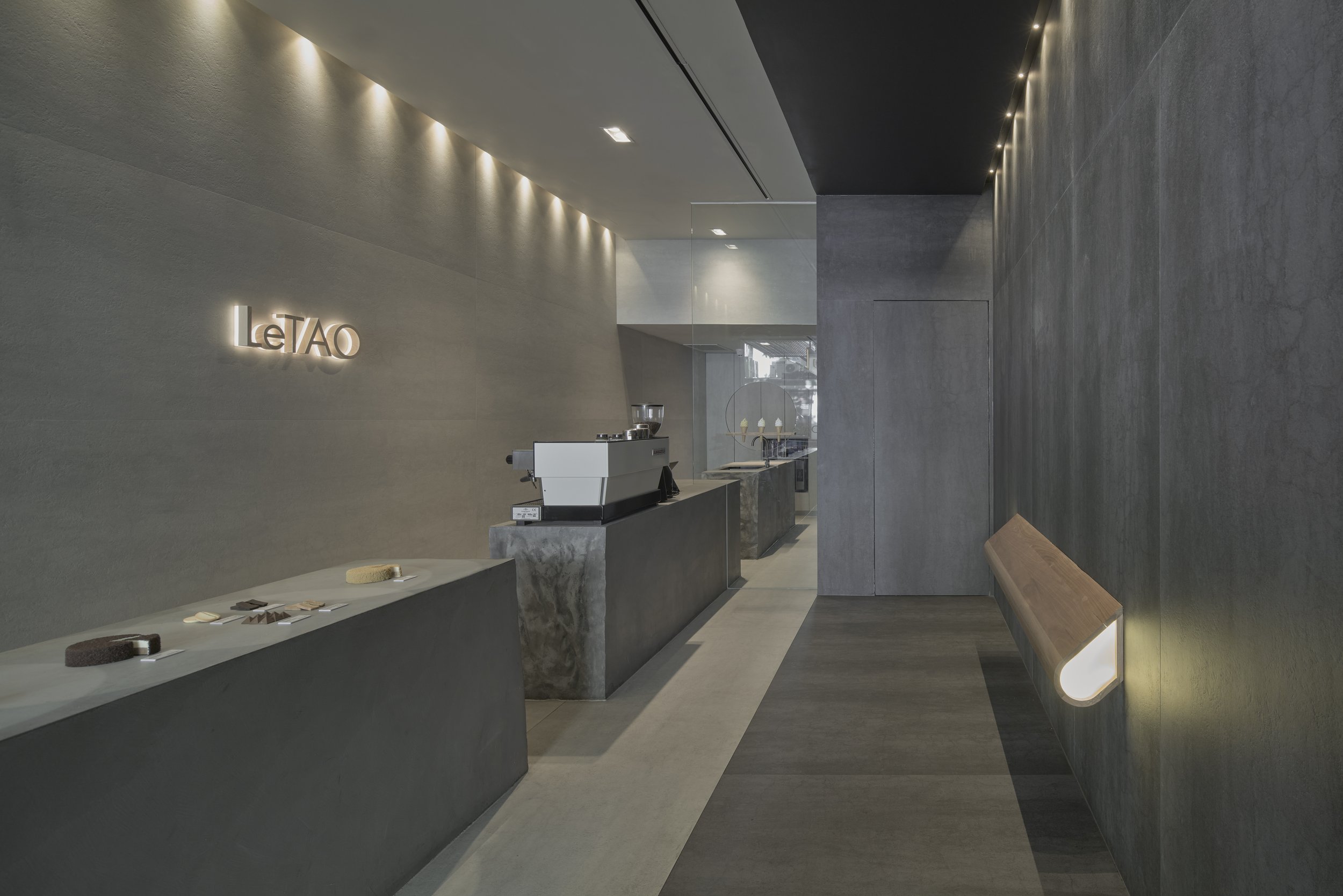
LeTao Australia's flagship store in Melbourne is a perfect example of how interior design can make a significant contribution to positive globalisation. K.Holland Architectural Interiors took a deep dive into the spirit of Japanese design to extract the essence of what Australians recognise as Japanese. The result is a stunning interior that has given the LeTao cheesecake brand a new face for its debut in the Western market.
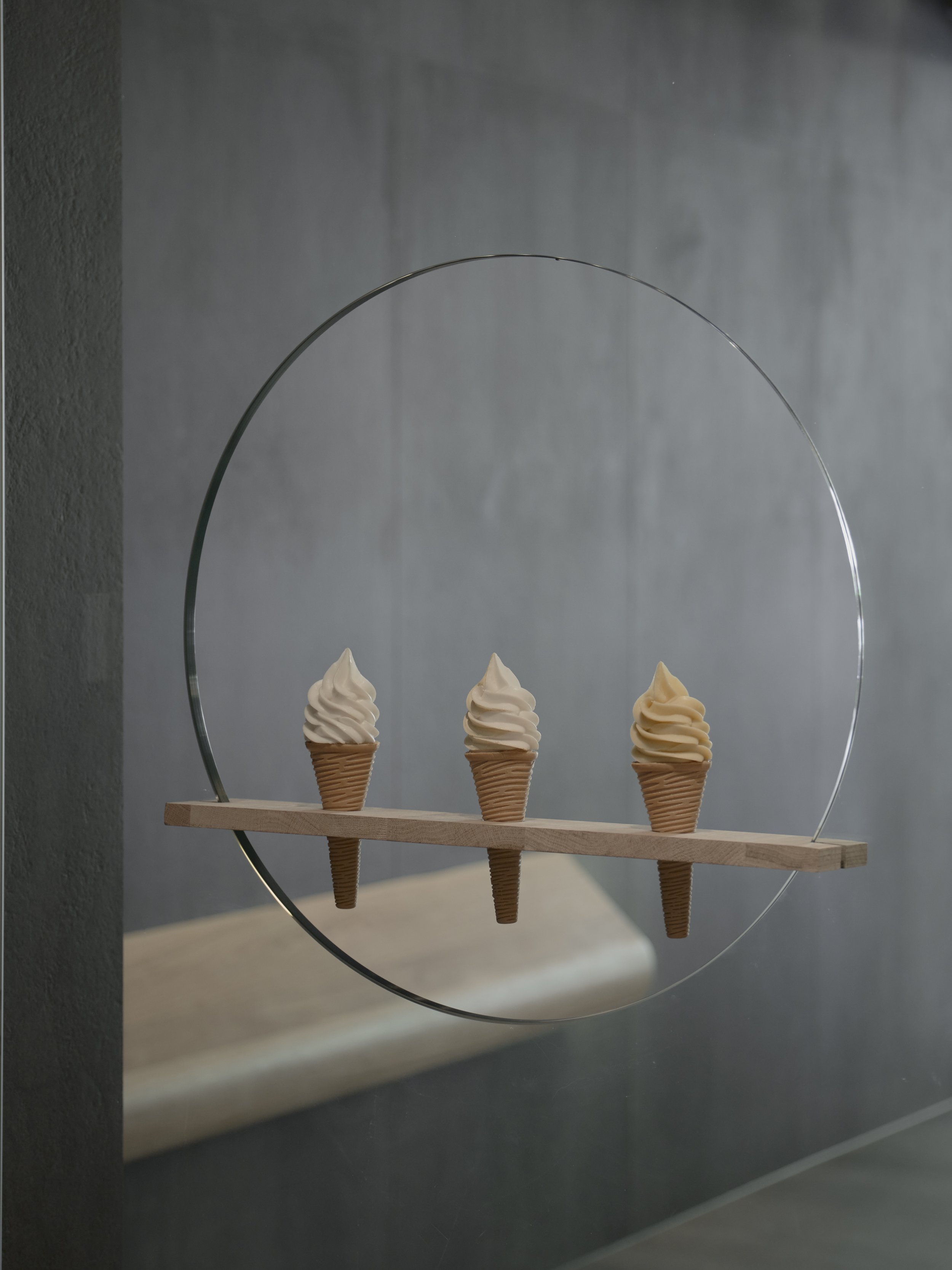
The design concept was achieved by defining three design principals that Australians recognise as Japanese: minimalism, strict geometry, and raw materials. The simplistic yet dramatic interior showcases the vibrant desserts as precious ‘jewels,’ evoking a sense of luxury that also comes with purchasing and eating a LeTao treat. The strict geometry of the space creates clean lines and the illusion of space, thanks to a change in colour that extenuates the length of the store.
The centrepiece of the store is a singular bench that runs the length of the store, functioning as a service counter, food display, coffee bench, prep/packaging bench, refrigeration, and storage all in one. The bench is uncomplicated, strong, grounded, raw, and earthy, with jagged ends that are reminiscent of an ancient stone ruin. The bench also dramatically penetrates the shopfront, engaging with pedestrians and enticing them into the store.
The sparse selection of materials and monotoned palette complement the colourful products perfectly. Large format porcelain tiles were used to create a singular floor to wall surface that imitates the earthy texture and durability of stone.
The directors of LeTao in Japan initially expressed concern that the design concepts were too modern, as their vision of the brand centred on a countryside aesthetic reflective of the Hokkaido region where the cheesecakes are produced. However, the design team was able to alleviate their concerns by explaining how the design evokes a sense of connection to the earth with its stone-inspired textures and solid rock-like forms. By the end of the project, the directors were pleased with the outcome, stating that the store set an example for future LeTao stores in all other European countries.
This project shows that a lot can be achieved with little. Small space, few materials, and less clutter combine to create a stronger message, and most importantly, a more sustainable flagship store interior.
K.Holland Architectural Interiors is dedicated to creating equally poetic and pragmatic environments that improve lives.
Instagram: @kholland.ai
Website: khollandai.com.au
Related Content
Goodwill Dental by Zone design
The design prioritises natural and comfortable tension, considering the space's structure, scenery, and environment, to convey a refined lifestyle through white and healthy teeth.
Entorno Tulum by Jaque Studio
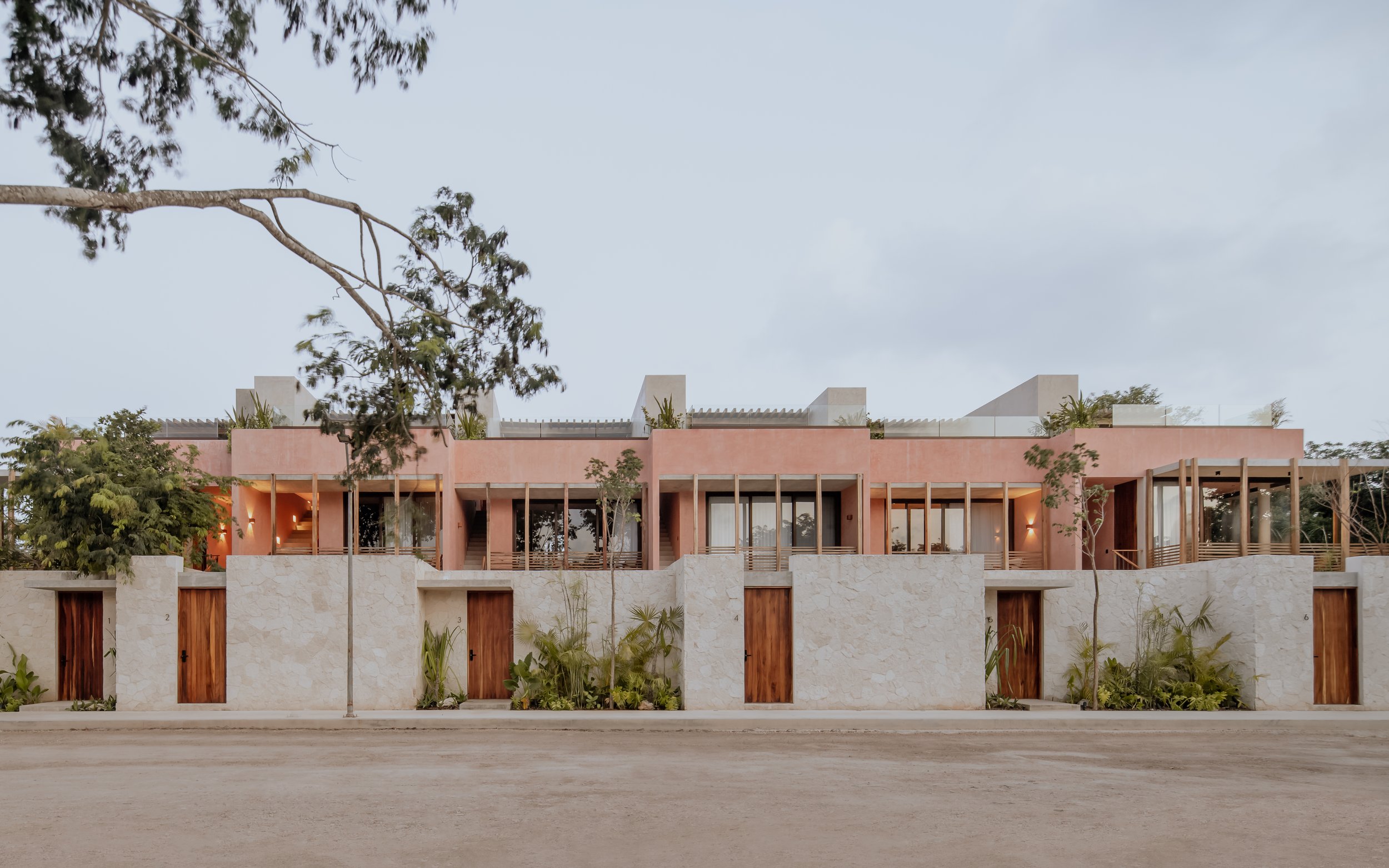
Entorno by Jaque Studio is a captivating response to the call for a flexible abode, one that can serve as a long-term residence and a beguiling vacation rental in Tulum, Mexico.


