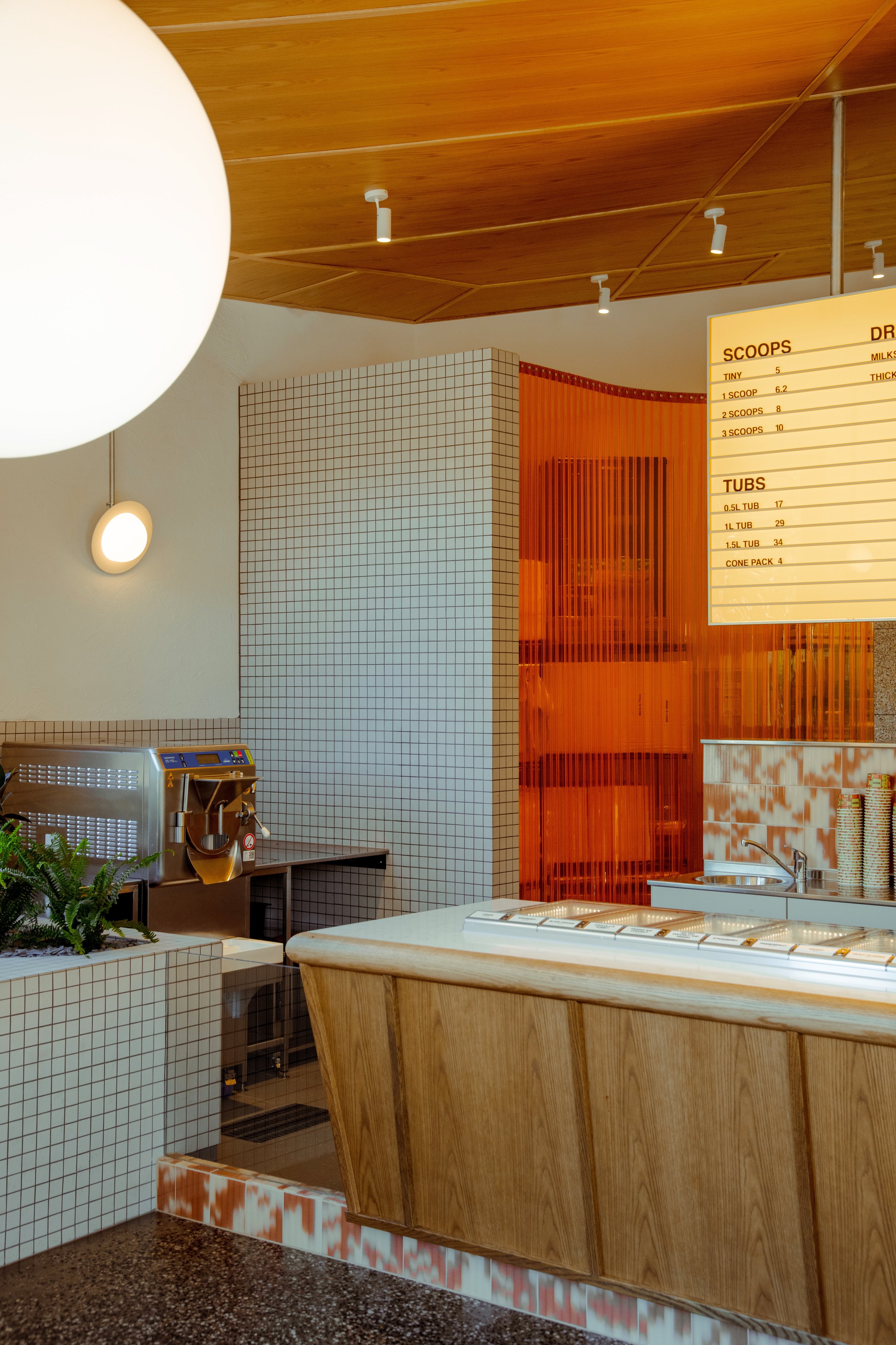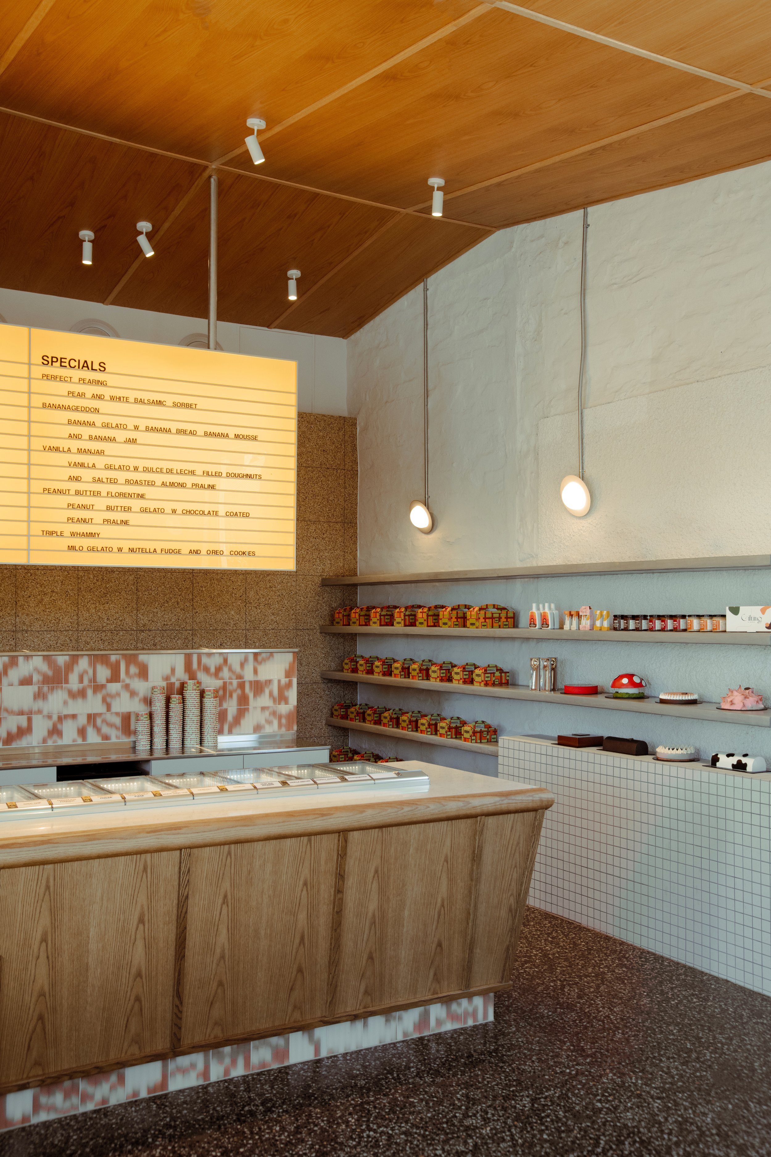
Sans-Arc Studio transformed an old workshop into Gelato Messina Kent Town, a vibrant, retro-inspired flagship store. It blends the original structure with new, quality materials and functional furnishings for a timeless, unique customer experience.
Architecture & Interior
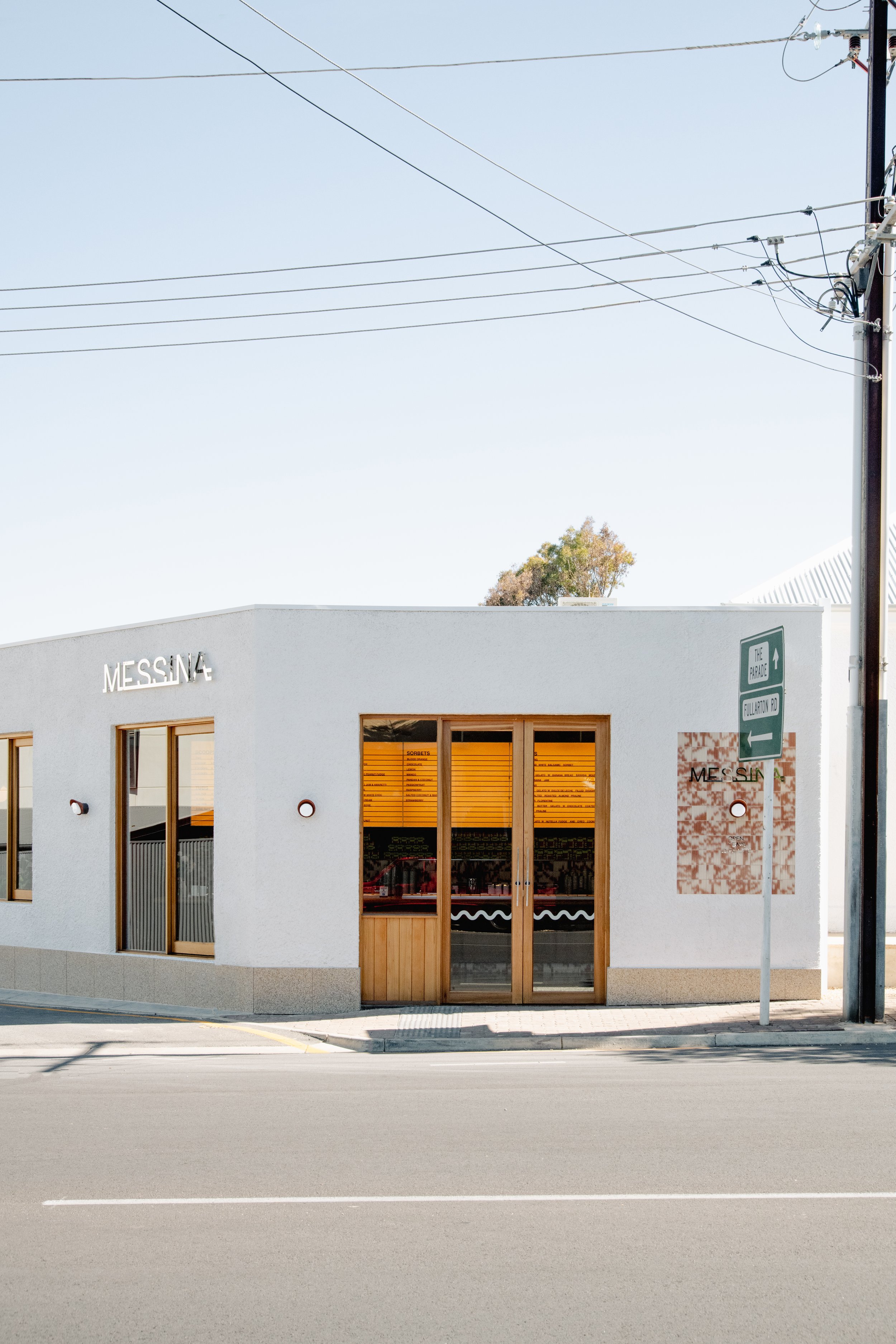
The Gelato Messina Kent Town, designed by Sans-Arc Studio, marks the brand's debut in Adelaide, symbolizing a homecoming for the owners. This project breathes new life into an old workshop, drawing inspiration from the 'retro' aesthetics of Gelato Messina's inaugural stores.
The design strikingly juxtaposes the original structure - luxe against industrial, polished against rough, with vibrant colours and patterns standing out against a backdrop of textural whites.
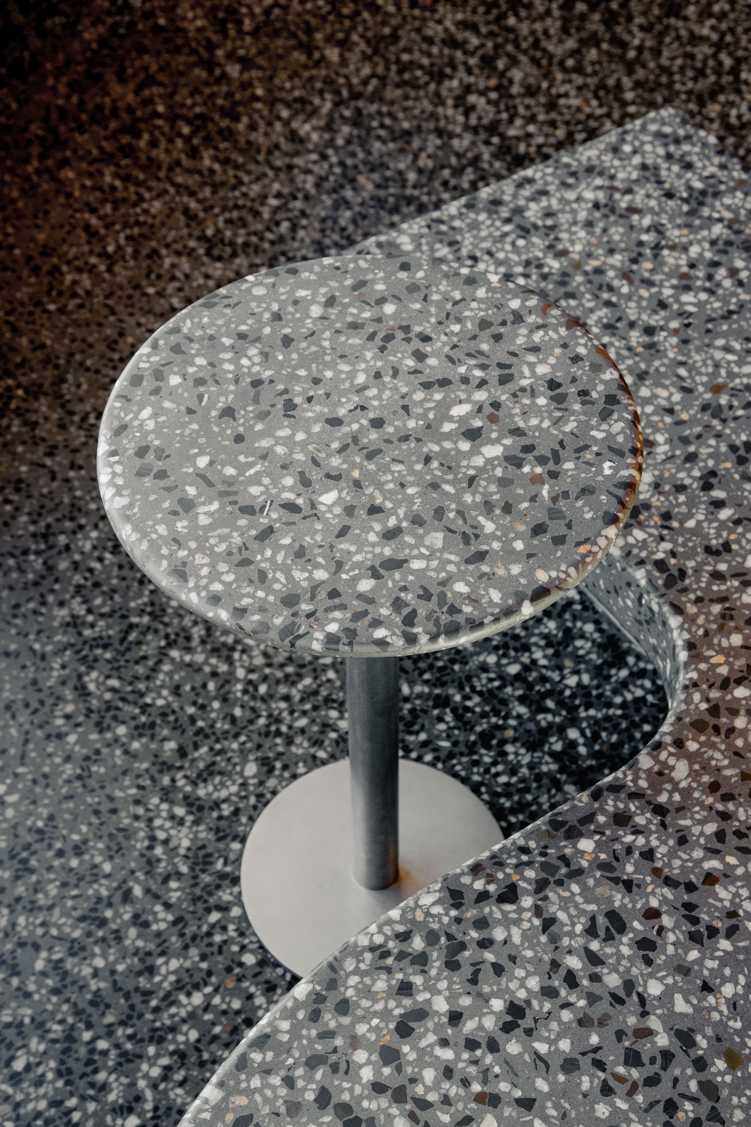
This store is a flagship for Gelato Messina and, for the foreseeable future, a standalone in Adelaide. The vision was clear: materials that withstand the test of time and a design that leaves a lasting memory. The look and feel of the store echo the original Messina aesthetic - a balance of retro and mid-century. A fondness for terrazzo and tiles is evident, drawing a connection to the yellow terrazzo porch of the attached house (destined to be a restaurant) and the typical Australian-Italian suburban homes.
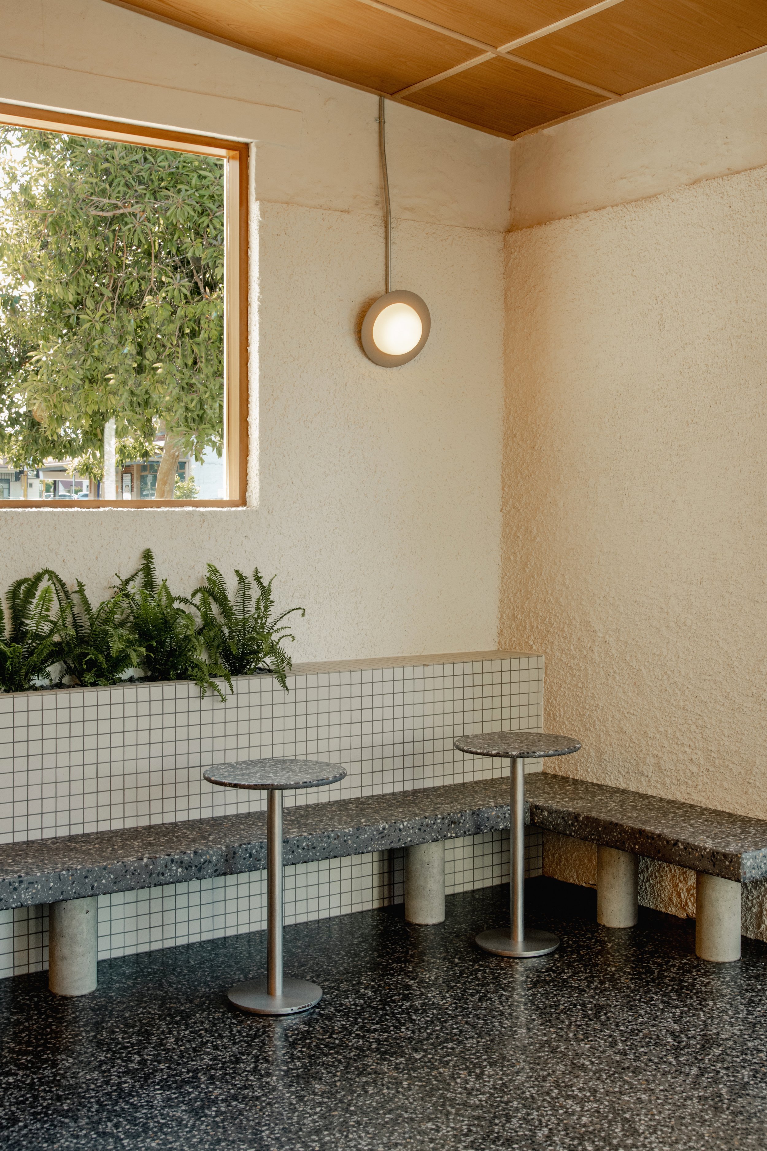
Tucked away on an obtuse corner, the design maximises the old workshop's openings. Large timber windows draw in an abundance of light, creating a visual link to the street. The restricted pedestrian access informed the front door's placement, with concrete furniture guiding the flow of customers in and out.
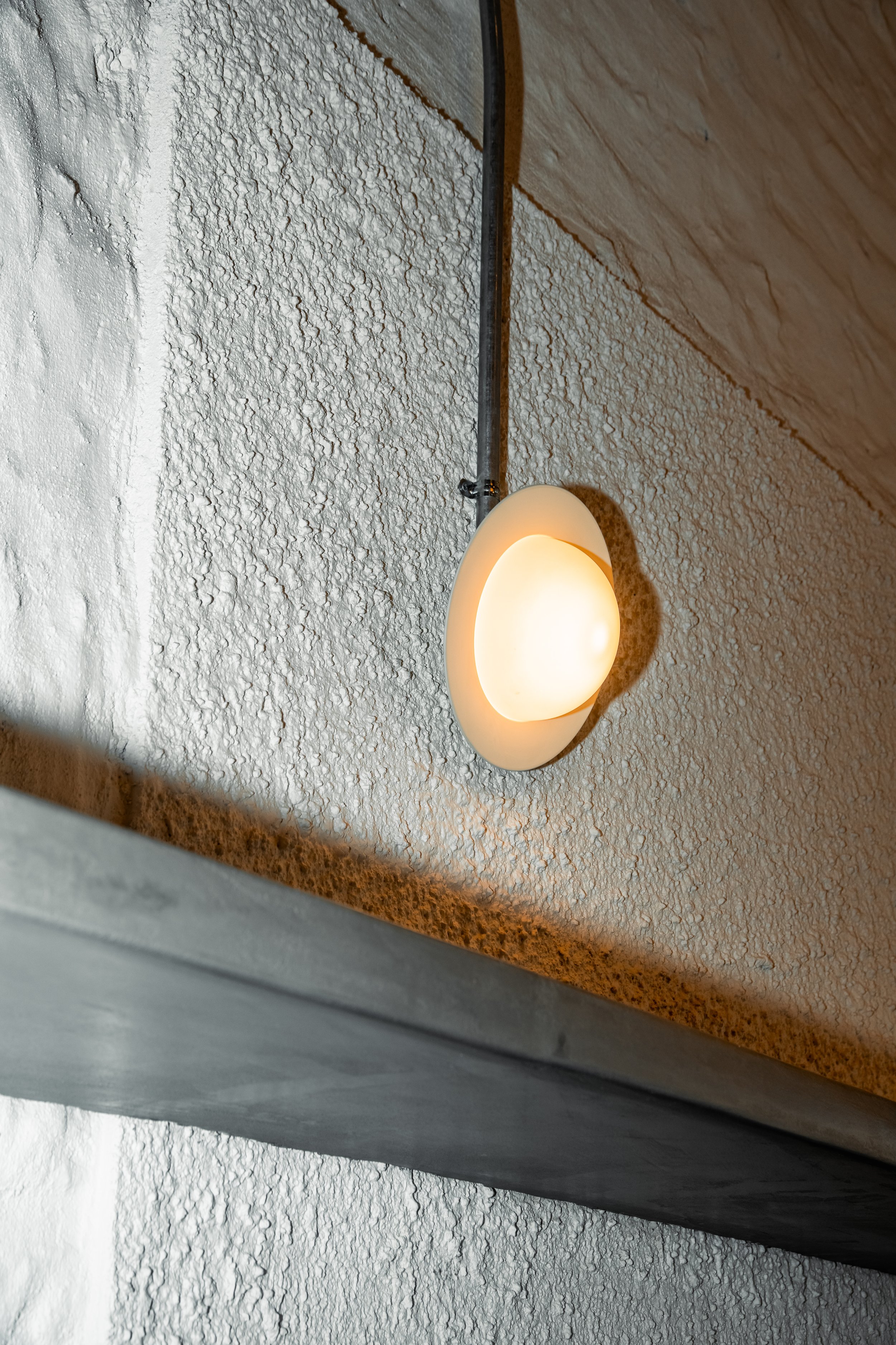
The project honours the original structure by blending in the existing blue stone, old concrete, and brickwork, both old and new. This creates a textural envelope and backdrop, against which 'retro' feeling materials stand out in playful and strong contrasts. White speckle against orange vinyl, a golden lightbox against a timber ceiling, and the interplay of industrial and retro elements all contribute to the store's distinct aesthetic.
As custodians of the building, the designers focused on restoring the existing structure to ensure its flexible and practical use in the future. The use of robust and functional materials that respond to the client's brief and the context, coupled with a design that allows for flexibility for current and future occupants, is a key feature of this project.
The team favours the idea of timeless design, quality materials, and efficient construction as an underpinning tenet for sustainability. By eschewing trends and crafting a visual identity that echoes the business it represents, the space exudes a unique charm that resists the passage of time.
The designers have masterfully employed limited but thoughtful fixed furniture to manage crowds. Concrete benches provide just enough seating for customers to enjoy their gelati before moving on, while heavy, loose tables offer flexibility during busy or quiet times.
The material treatment of the former workshop is innovative, showcasing intriguing elements and textures, and giving a new lease of life to the building that respects its past. Each material was selected for its relevance to the clients' identity, the business, the site, and its practical requirements, weaving an emotional and memory-infused narrative into the material selection.
Related Content
Fusina is a sculptural fire pit designed by José Bermúdez, paying tribute to the architectural style of Venetian architect Carlo Scarpa, with an intriguing organic shape that enhances the connection between the object and the user.
Located in a village near Albacete, an annex to a nursery school designed by Iterare arquitectos combines interconnected volumes with an engaging interplay of light.
In Burgos, Spain, a unique cultural centre melds homey comfort with communal utility, redefining perceptions of public spaces.

