Chapter 1 : Create
In Conversation with Jessica Jung, an interior and prop stylist based in London, whose work reflects her deep appreciation for the interactions between objects in an image and the surrounding space.
Continue reading to learn more about what led her down the path of becoming an interior and prop stylist, what it means to create a sense of order in a work, and her latest project, Art of Glass.
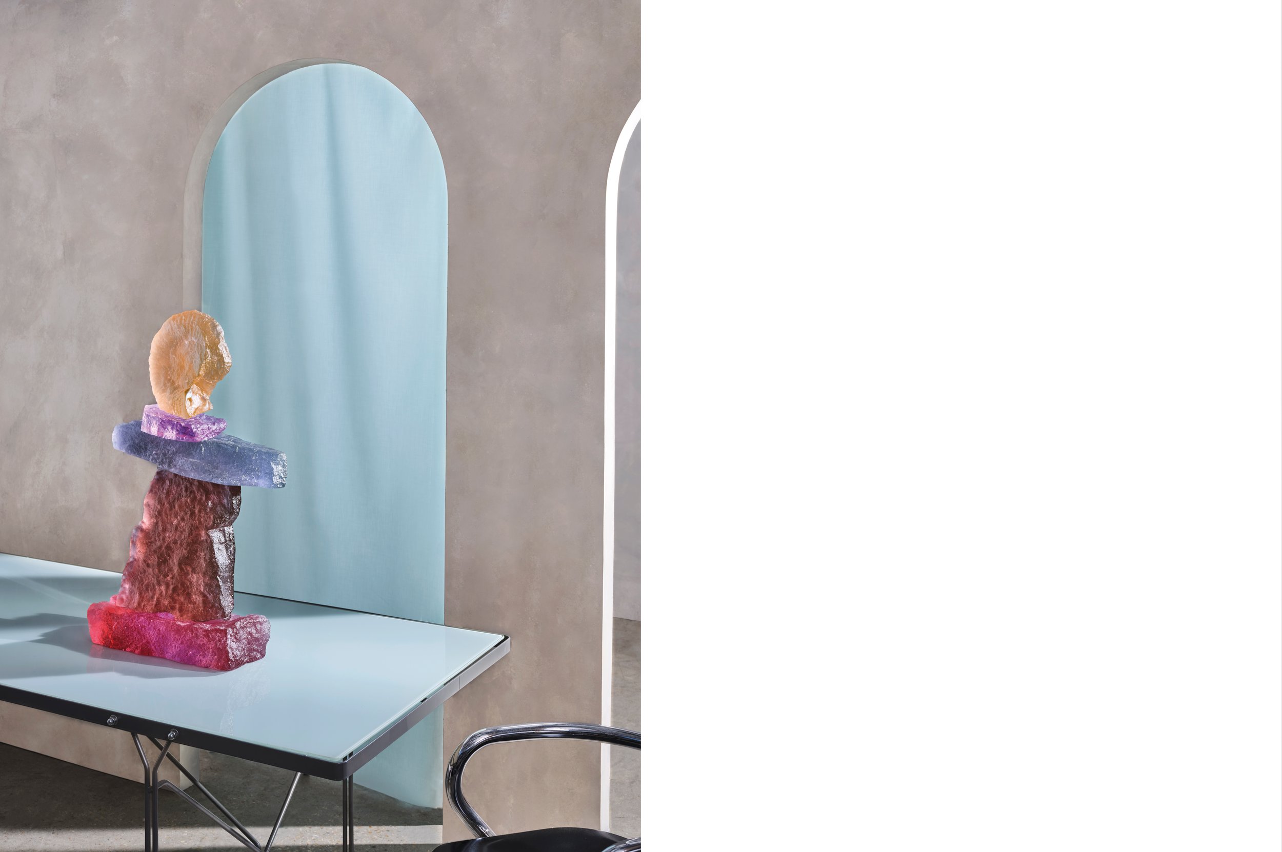
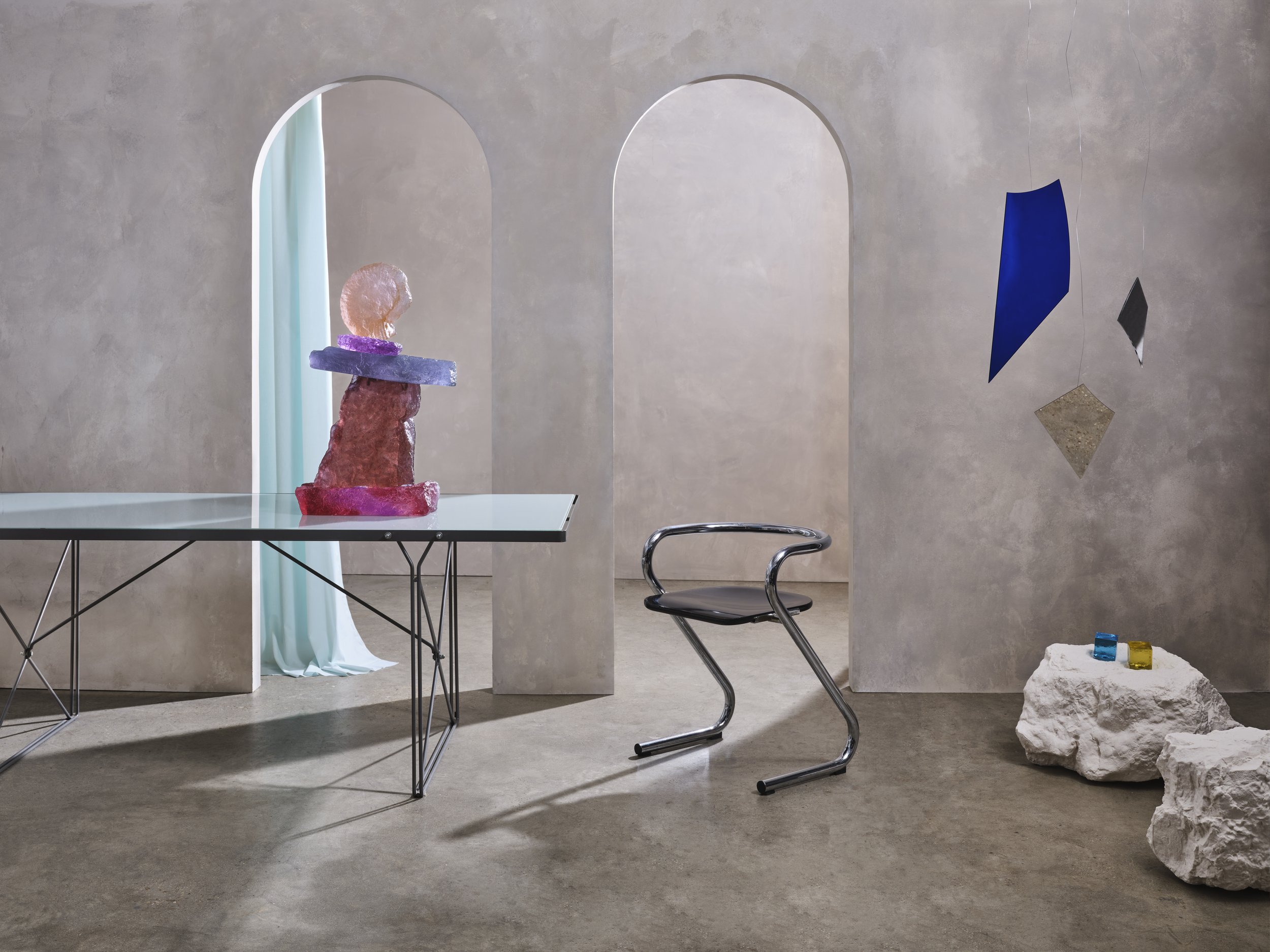
Art of Glass by Ian Tillotson
Portrait by Felix Speller
In a static space, it is the photographer's responsibility to record an image and the stylist's task to convey the messages and attract viewers to the world expressed behind the image. While the photographer is the creator of the image, the stylist creates the atmosphere of the shoot. Within the camera frame, the stylist organises the story expressed within the framework through the colour palette, desktop objects, and light and shadow. By changing the angle of objects and light and dark tones, the stylist can easily plan or alter the viewer's first impression of the image, acting as a guide.
Jessica Jung is a London-based interior and prop stylist whose work reflects her deep appreciation for the interactions between objects in an image and the surrounding space. Through her designs, one can perceive the interplay between objects and the connection between space. For Jessica, every creation is an engaging process that involves a thorough understanding of the principles and elements of design as well as an intuitive feel for the unique qualities of each space she works with. Continue reading to learn more about what led her down the path of becoming an interior and prop stylist, what it means to create a sense of order in a work, and her latest project, Art of Glass, created in collaboration with photographer Ian Tillotson.
1. Hello Jessica, thank you so much for taking the time out to answer some of our questions! For those who are not familiar with your work, would you mind starting off by briefly introducing yourself and what led you to becoming an interior and prop stylist?
Jessica Jung: Hello! I’m Jessica, a London based stylist working in interiors & still life shoots and events. I fell into the world of styling after I graduated from architecture school and started working for a wallpaper company. This is when I started to create interior sets for their products, unknowingly beginning my journey into styling.
I was mesmerised by this “hidden” world and loved this pursuit of creating beauty with objects and furniture. I love the partnerships you build with talented makers and designers, and interpreting their work into a lifestyle context. I made the leap to go freelance when I moved to London over 4 years ago.
2. Coming from a background in architecture, what did you find most challenging when transitioning to the field of styling? What are some of the concepts / philosophies that you learned from your past experience that you could also apply to prop and interior styling?
JJ: When designing spaces in architecture, it’s about functionality and flow of space, whereas styling for photoshoots, you’re designing a space that has to work in the contained frame of a camera. This was the most challenging aspect with shifting from architecture to styling, to look at spaces from a singular point of view. It means that every element has to be placed with careful consideration, creating a level of tension and balance to give an overall sense of calm and understanding of the space - all of which you hope carries through to the viewer.
Architecture gave me a good grounding in composition and design principles, most importantly illustrating the power of colours in spaces. I was fascinated to learn about Le Corbusier’s colour system and theories, something I still refer to for my projects today.
3. How would you describe your process when working on a new project? You do interior, still life, and event styling - does this approach differ between the three?
JJ: There is an element of storytelling with all of my projects. My process begins with defining the story then carefully curating every element that goes into the shoot or event. Whether it be the colour palette, tabletop objects or lighting - every aspect has to be pulling its weight in conveying the overall story. My process has a lot of similarities between interior, still life and event styling.
Ultimately, the way the viewer sees your work is key and creates an irreversible visual order. With events, the initial viewpoint sets the scene and the order in which you travel through the space is important but not strictly defined - you are designing a continuous rather than rigid space.
With still life and interior photography, although the visual order is equally important, I have greater control to dictate and curate what the viewer sees in each shot as I control the perspective.
4. Who or what inspires you?
JJ: Styling is a mixture of disciplines, it’s an alchemy of different artforms working together simultaneously - it can be a mixture of sculpture, painting, floral arrangement, textiles and so on. Because of this, I allow myself to find inspiration from anything from everyday objects to sometimes seemingly trivial ideas.
My ultimate design heroes are female architects such as Gae Aulenti and Charlotte Perriand, who were real pioneers of their time when women were often overshadowed by their male counterparts. With the design industry still disproportionately male, I really look up to women running their own studios and I have been fortunate enough to work with stylists like Hannah Franklin & Louisa Grey who helped my career immeasurably.
5. Can you tell us a bit more about your recent project, Art of Glass? What was the idea behind the project?
JJ: Speaking of everyday influences... I was initially inspired by Blondie’s song, Heart of Glass, especially the era’s unapologetic boldness and use of bright hues, echoed in the kaleidoscopic interiors of the time. I was equally mesmerised by contemporary glass artworks I’d come across and whose use of colour was similarly hypnotic.
Ian Tillotson, the photographer who I collaborated with on the project, and I wanted to explore the plethora of colours and textures emanating from these extraordinary glass artworks. We were inspired to combine them with modern furniture with curious finishes, all set against an futuristic backdrop. We wanted to take the viewers into an otherworldly space that celebrated these artworks to their fullest.
6. You worked with photographer Ian Tillotson on this project. As a stylist, how do you communicate with photographers to ensure that your concepts/vision is captured and conveyed in the way imagined?
JJ: The communication between a stylist and a photographer is fundamental to a successful collaboration, it’s your combined vision that shapes the final outcome. Ian and I started discussing the series during the early concept stages so we were able to exchange both of our ideas from a styling and photography point of view.
From a practical sense, we communicate through image references and hone in on what we want people to feel when they look at the imagery - distilling this into a single paragraph that becomes our reference point at every stage of the project.
“I strive for my styling work to have a sense of order. I try to avoid unnecessary embellishment and, instead, embrace lushness through colour and materiality. Through this, I hope that people will experience a spark of inspiration and a shared appreciation of the space.”
Makers of the Art of Glass
Beton Brut, Dawn Bendick, Everything But The Dog, Flow Gallery, Matteo Fogale, Max Jacquard, Mint Shop, Modern Art Hire, WonderGlass, &New, Bad Star Studios, & Tim Warren Set Build.
7. There seems to be a strong emphasis on light, colour, and texture in your concepts/compositions. How important do you think these elements are in immersing viewers in your work?
JJ: Creating this interaction between light, colour and texture is what excites me the most about styling. It’s a sense of play with endless combinations that sometimes has the desired, or even an unexpected, effect. All of these elements working in harmony is what I hope will pull viewers to envision themselves in the space and create a feeling of intrigue as they slowly unravel each element of the image.
Another element I enjoy incorporating into my work is a sense of scale, for instance shooting a ceramic sculpture in a tabletop setting to appear larger than life can alter the viewer’s perception and create a feeling of surrealism.
8. How would you describe your aesthetic and how does this correlate with what you hope people will experience through your work / type of message you’re trying to convey?
JJ: Generally, my aesthetic is clean and understated. I strive for my styling work to have a sense of order. I try to avoid unnecessary embellishment and, instead, embrace lushness through colour and materiality. Through this, I hope that people will experience a spark of inspiration and a shared appreciation of the space.
9. What inspired your move to London? How would you describe the design scene in London and what new opportunities has the city presented?
JJ: The scope of clients that I can work with in London was a big pull for me. I wanted to work for a broad range of clients from interior designers, independent makers and global brands. It also presented new opportunities to work in different spaces and locations that are unique to the city, such as the British Museum which I was fortunate to shoot in last year.
The London design scene is so exciting, there’s a mix of cultures in the capital that brings such an array of design styles, making it innately unique and international in feel.
Jessica Jung is a freelance interior and prop stylist based in London.
Instagram: @jessicajungcreative
Website: jessicajungcreative.com
-
Art of Glass Project
Stylist: Jessica Jung
Photographer: Ian Tillotson
Makers: Beton Brut, Dawn Bendick, Everything But The Dog, Flow Gallery, Matteo Fogale, Max Jacquard, Mint Shop, Modern Art Hire, WonderGlass, &New, Bad Star Studios, & Tim Warren Set Build.
Related Content
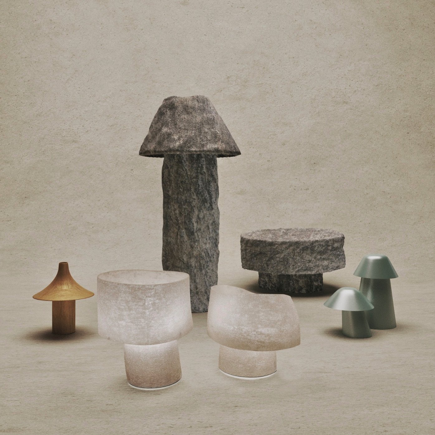
Mellow Mushrooms by Jorge Suárez-Kilzi
Jorge Suárez-Kilzi was born in Venezuela to immigrant parents of Spanish and Syrian descent. His collection of works is signed under his mother’s last name, Kilzi, which is also often used to describe a person who works with plaster and chalk - unconsciously leading Jorge down a path he was destined for.
Visualising the Invisible - In Conversation with Blackhaus
We speak to the founders of Blackhaus, Fernando and Deisi, to discuss their inspirations, approach to their craft and the growing interest in architectural visualisation.


