N HOUSE
AMBIENT REFORM
Words by moss Photography by TOREAL | Koji Fujii
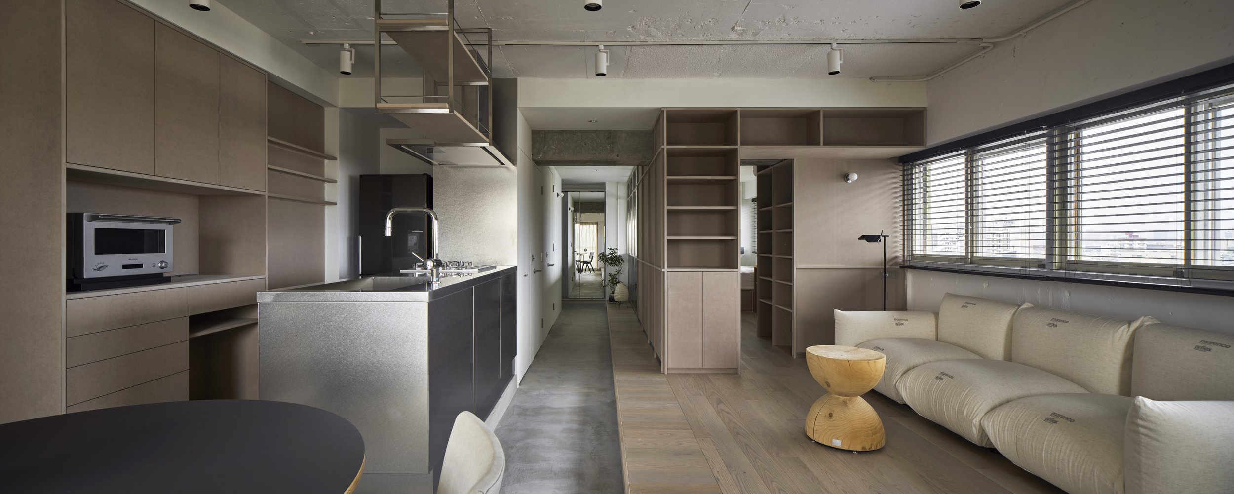
N House by moss. | Takeshi Shima was a renovation of an atmospheric vintage apartment in the Magome neighbourhood of Tokyo. The team transformed the original two-bedroom layout to a light-filled one-bedroom with a living room, dining area, and kitchen.
The clients’ requests were simple: good light, a large living room, and minimal use of colours. Working with the limitations of a 55-square-meter apartment, their intention while conceiving this design was to add richness and depth to the space. They focused on the following four elements:
Interior Terrace
Their concept for the living room centred on creating the atmosphere of an outdoor “terrace” space inside a metropolitan Tokyo apartment. Up against the limitations of a small floor plan, they took a risk and added a protrusion into the empty space. The interior terrace does not limit the functionality of the room. It opens up the area and adds an enriching “margin” to the room, creating a beneficial sense of distance between people within the space.
Horizontal Windows’ Charm
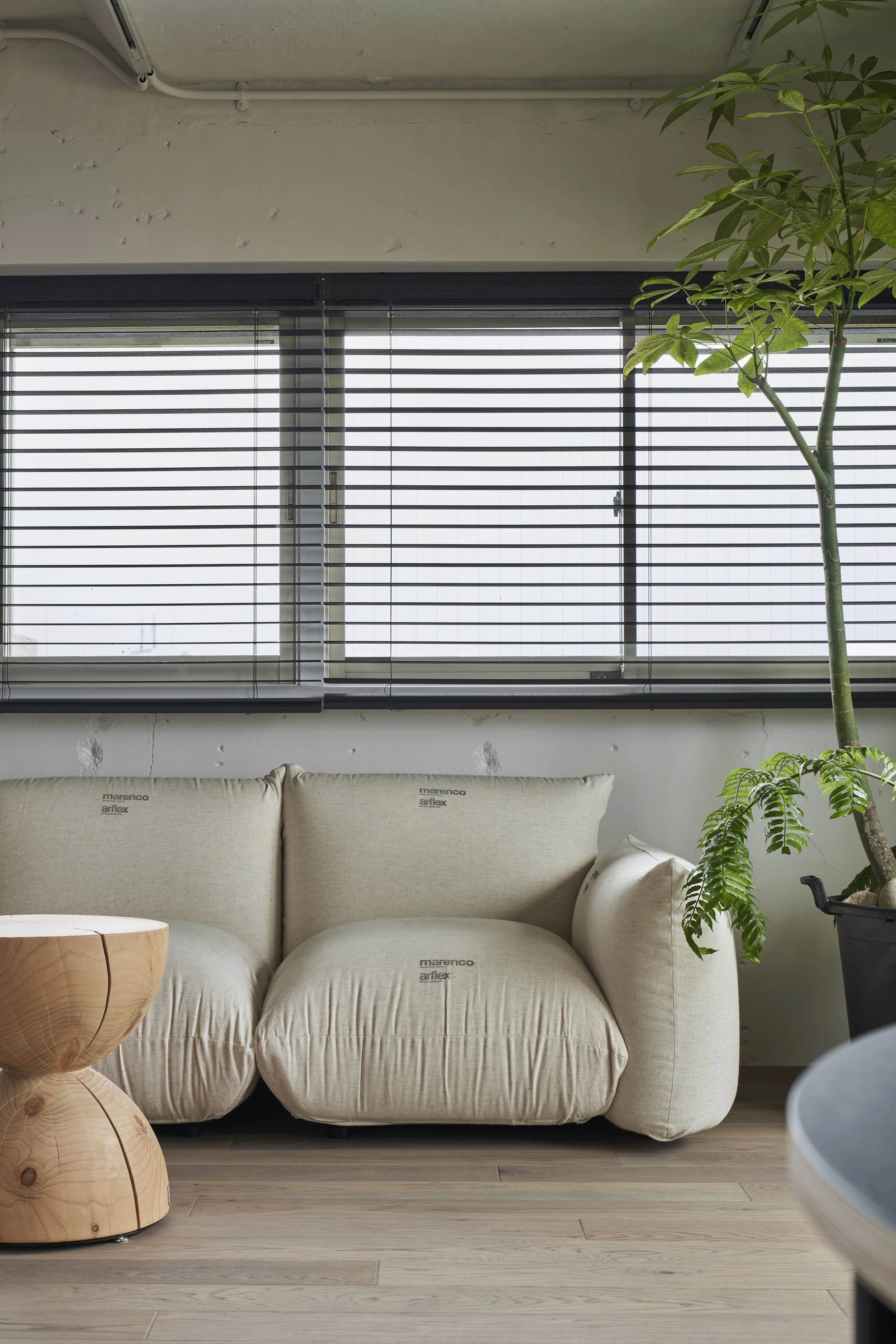
The apartment’s horizontal windows, which are rare in today’s housing complexes, have a unique charm that they wanted to emphasise. they drew in ample natural light and made the room feel more spacious by taking advantage of the windows’ shape and orientation in our new floor plan.
Compact Depth
Integrating the bedroom, study, and storage spaces into a single room at the core of the apartment, they added depth to the apartment while making economical use of floor space. The design and materials incorporate a sense of “comfortable confinement” similar to a downtown hotel.
Cherishing Shadows
The new layout gives the feeling of light entering from far back in the space. Creating a corridor that dared to cast shadows to emphasise the expansiveness of the living room. The balance of light and shadow adds depth and flexibility to the space.
These four elements were integrated through a minimal approach to colours, which was also in line with the client’s request.
The oak flooring is dyed grey. All fixtures are custom-made with grey MDF, and the walls are painted with textured paint from Haymespaint. The design is accented with a dull glow from the window sashes and stainless steel in the kitchen.
Exposing the raw skeleton of the apartment could create a cold and unwelcoming atmosphere, but the subtle warmth of grey materials and painted surfaces draws out the richness originally present in the apartment’s bones.
The client’s tasteful furniture selection and bold house plants adds power to the spaces. While the apartment’s ambience is undeniably urban, it also invites people to pass their time in the space relaxed and unhurried.


